SCREENSHOTS → IMAGEGEN → IMPLEMENTATION
A record you can compare.
Each cycle preserves the original desktop and mobile screens, the generated proposal, the decisions we made, and screenshots of the working result.
Generated proposals are visual suggestions. The implemented screenshots and sample pages are the product to review.
Four completed cycles. Switch Desktop / Mobile within each cycle, or open any screenshot at full size. Prompts and decisions are preserved below.
CYCLE 01 · CREATE & REVIEW · COMPLETE
A clearer place to begin.
Group the wallet assets, repair mobile navigation, make each step readable, and give the review actions their own panel.
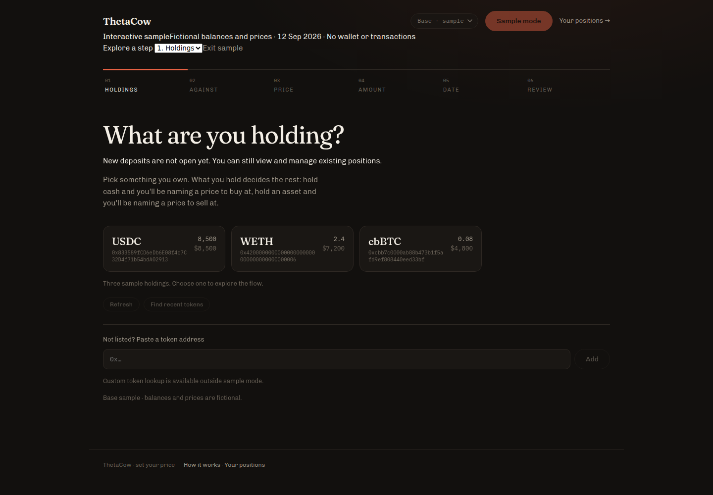

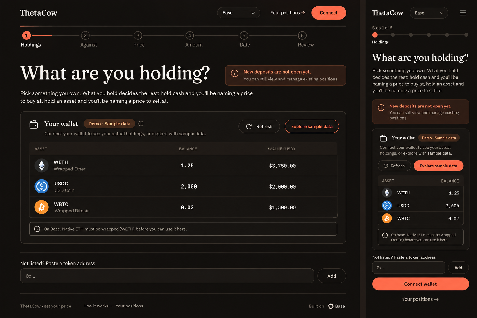
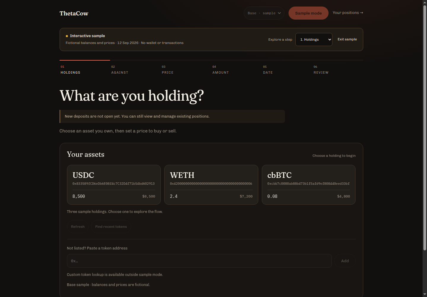
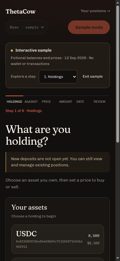
Implemented
- A bordered wallet panel with distinct asset cards and readable balances.
- Two mobile header rows, direct Positions access, and a current-step label.
- Brighter supporting text, visible keyboard focus, and 44px primary controls.
- A desktop review card and separate action panel; both stack on mobile.
Adapted or rejected
- Keep contract addresses visible; logos and symbols cannot identify tokens.
- Keep direct navigation instead of adding a hamburger menu.
- Do not publish generated balances, return claims, or implied deposit admission.
- Use the proposal as design input; implement the result in HTML and CSS.
Checked all six steps at 320, 390, 768 and 1440px: no page-level horizontal overflow. Before: 447px content at a 390px viewport. After: content equals client width. Supporting-text contrast on the page background increased from 3.26:1 to 7.01:1. Browser console clean.
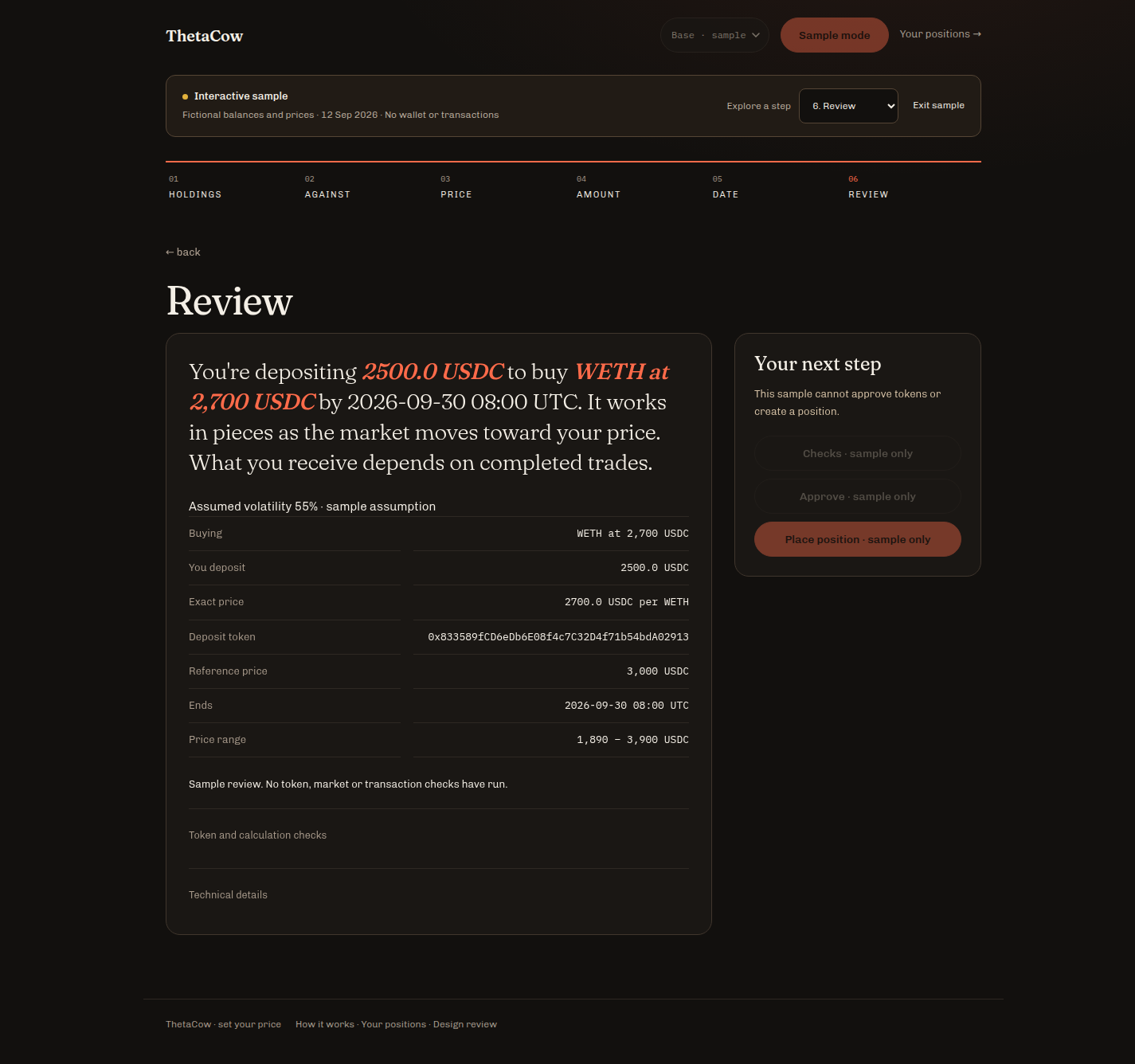
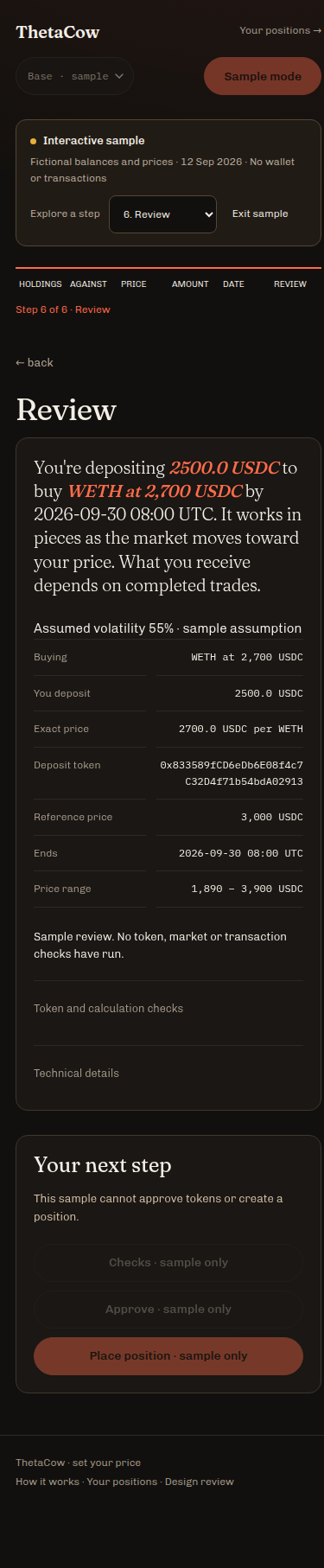
Original inputs, prompt and decision record
Original disconnected desktop input · Original disconnected mobile input


Exact imagegen prompt · Triage notes · Viewport measurements
CYCLE 02 · POSITIONS & RECOVERY · COMPLETE
See what needs attention.
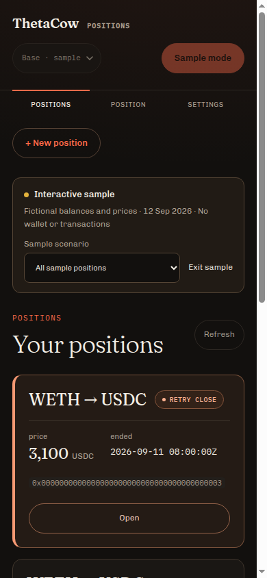
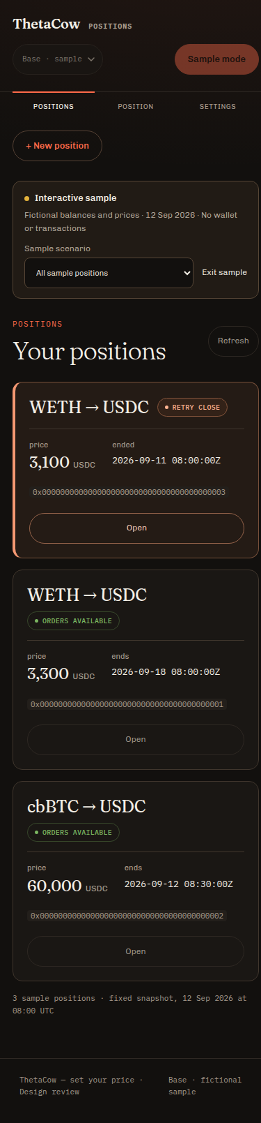
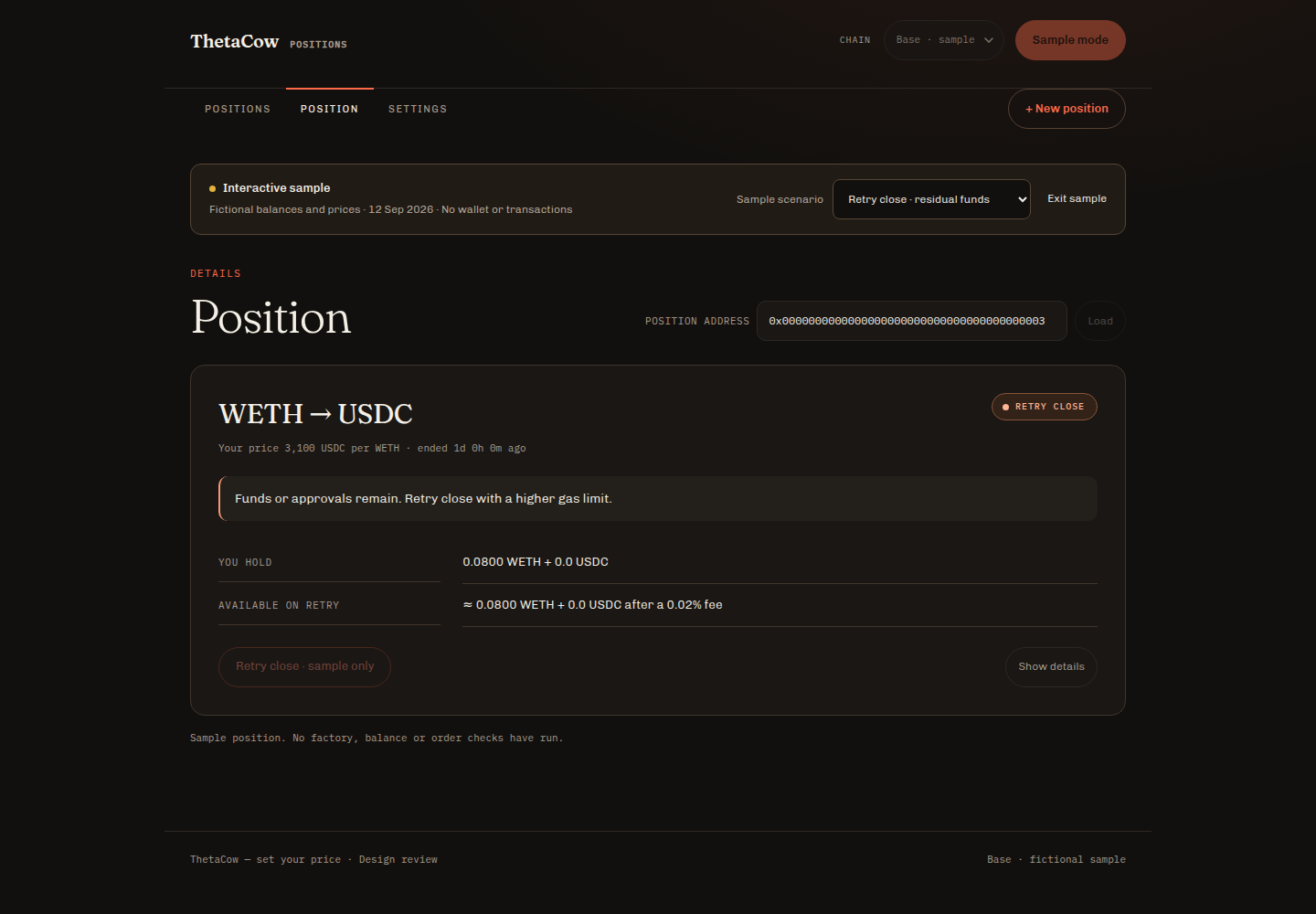
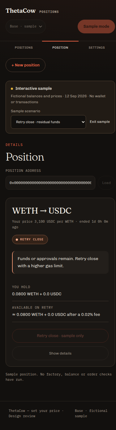
Make the position status, price, date and next action easy to scan, with a clear path to residual funds.


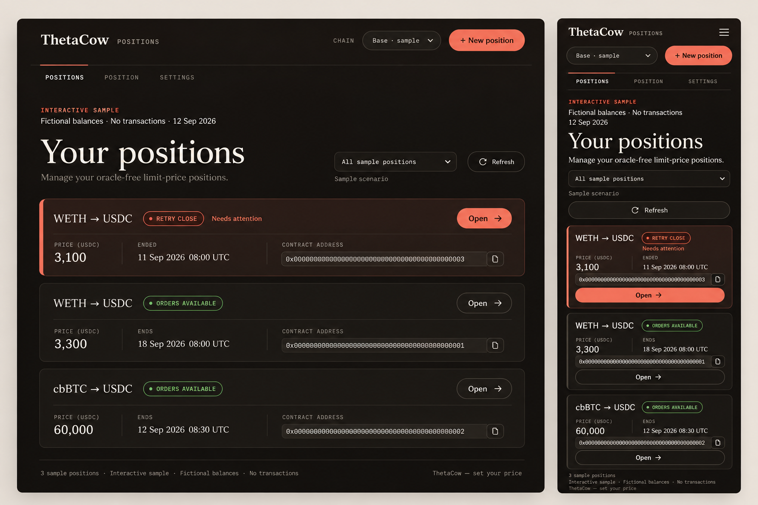
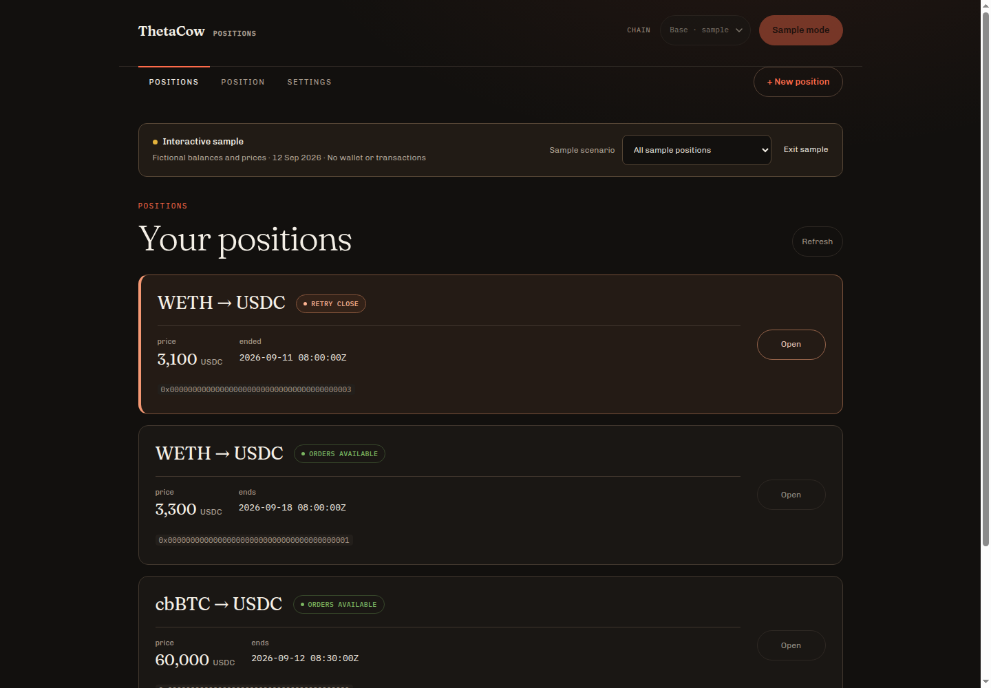
Implemented
- A warm attention border for positions with residual funds or funds to claim.
- Larger pair titles, grouped prices and dates, and visible quote-token units.
- Responsive navigation and full-width Open actions on mobile.
- Readable recovery details, exact values that wrap, and distinct empty/read-error samples.
Adapted or rejected
- Preserve the wallet control and lifecycle rules; the generated layout cannot change them.
- Keep exact address links; do not ship decorative copy buttons.
- Do not invent portfolio balances, returns or charts to fill space.
- Orders available and final hour describe state, not a promise that an order filled.
Checked portfolio, working, final-hour, recovery, empty and read-error samples at 320, 390, 768 and 1440px, including expanded details: no page-level horizontal overflow. Real Open/Show details interactions and console checks passed. Independent review found no demo wallet, RPC, storage or signing calls, including with the actual wallet bundle loaded.
Prompt, decision record and measurements
Exact imagegen prompt · Triage notes · Viewport measurements
Final verification and capture notes
Full regression test output · Ordinary disconnected mobile screen
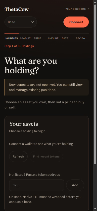
The first sample desktop capture was only 500px wide. Its replacement was captured at 1440 × 1000 from the still-open original page, with basic.css?v=12 and the original markup. The 500px capture remains archived. No baseline image was reconstructed or edited. Full-page mobile exports use the 375px content area inside the 390px browser window; viewport captures include its scrollbar.
CYCLE 03 · LANDING · 14 SEPTEMBER 2026
Show the instruction. Lose the essay.
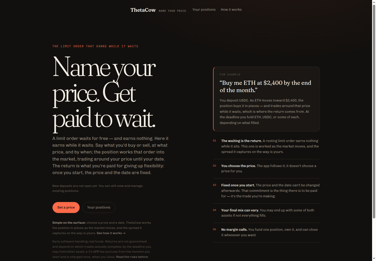
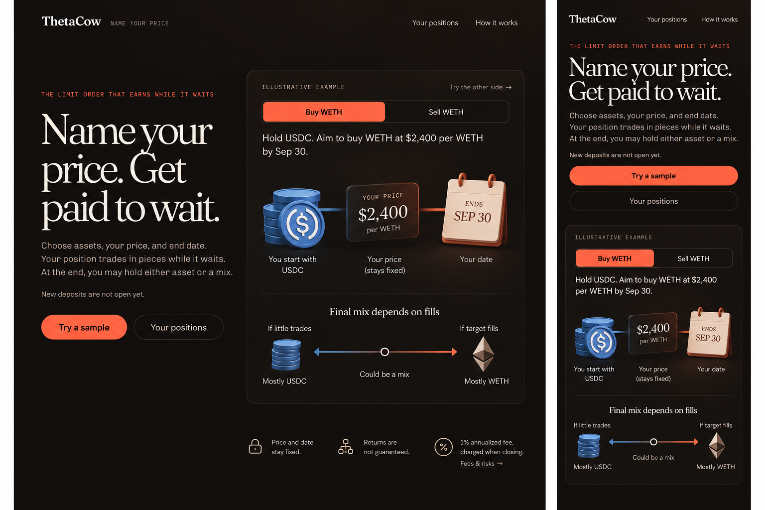
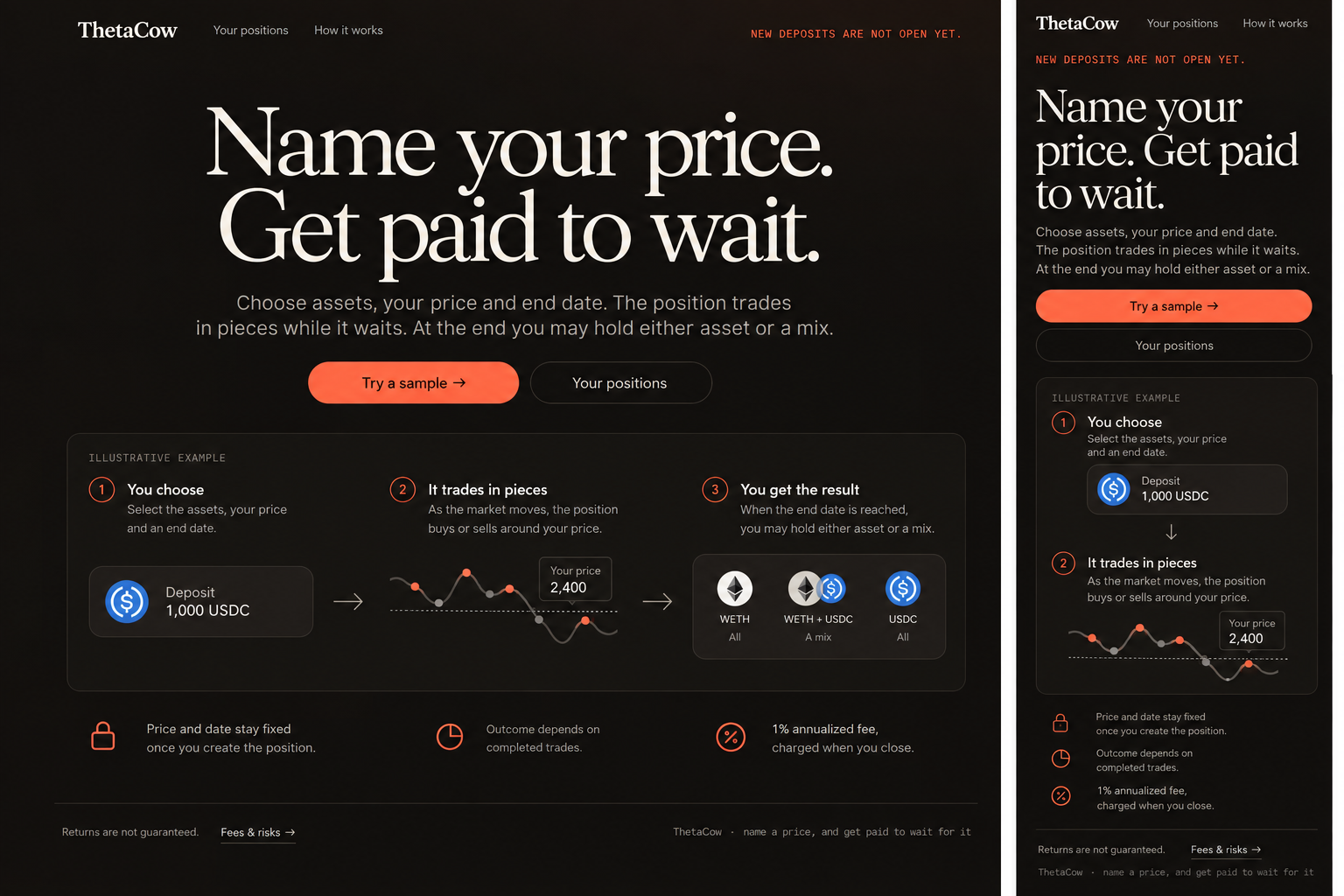
Two imagegen hypotheses: a three-stage flow and an interactive example. The example becomes a compact native infographic with much less text.



Kept from the concept
- One concrete example, with Buy/Sell choices.
- A holding, a prominent price/date ticket, and possible final assets.
- Primary sample access before the explanation.
- Optional fees and risks, using a native disclosure.
Changed after inspection
- Replace “get paid to wait” with the inputs the user controls.
- Remove invented charts and simplistic fill-to-outcome rules.
- Keep USDC per WETH units and price/date commitment.
- Use native HTML/CSS for the infographic so text scales, keyboard controls work, and mobile keeps the outcome.
Main text: 348 → 81 words (77% less). Full mobile page: 2063 → 1134px. Primary action: y=819 → 324px, with a 54px target. Measured at a 390 × 844 browser viewport; full-page exports exclude the 15px scrollbar. Both examples and the open/closed disclosure fit 320, 390, 768 and 1440px. These are layout measurements, not proof of improved comprehension or conversion.


Concept A — not selected
Guide, prompts, decisions and verification
Applied IMAGEGEN-DESIGN-GUIDE.md: distinct hypotheses, inspect meaning before appearance, implement native controls, measure actual geometry, preserve evidence, then stop.
Full prompt A · Full prompt B · Triage · Measurements · Validation notes
Both concept boards used built-in imagegen with the same actual desktop/mobile references. The shipped graphic uses HTML/CSS; no imagegen screenshot is used as a functional interface. No wallet or transaction logic was changed.
CYCLE 04 · FIND YOUR DATE · 14 SEPTEMBER 2026
Let the date follow the trade-offs.
Name your price, set a time limit, then compare a few durations. No recommended yield or automatic date choice.
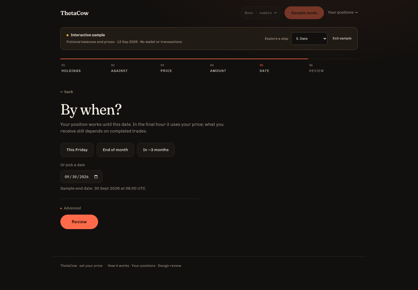
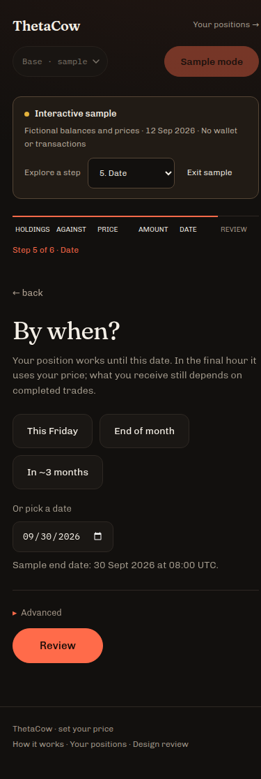
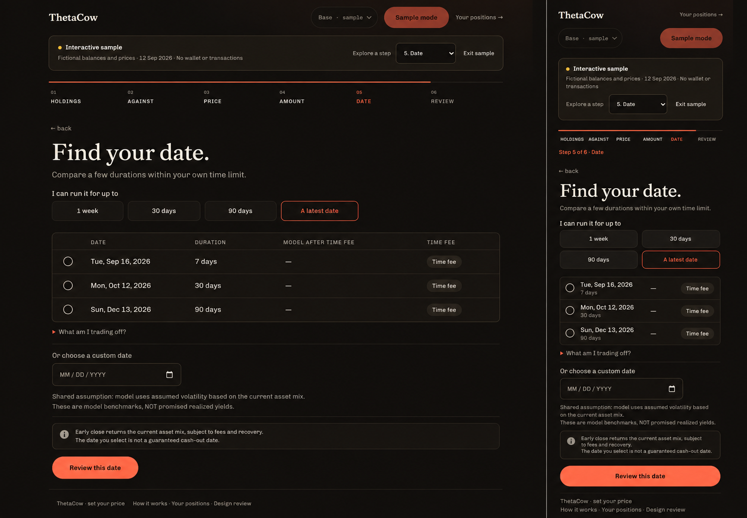
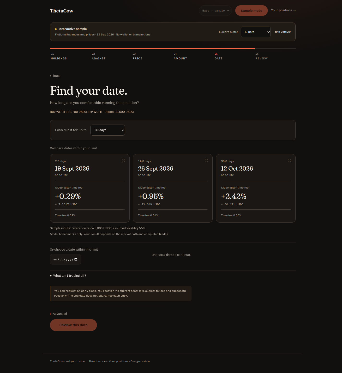
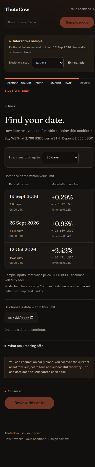
Implemented
- Time limits of a week, 30 days, 90 days, or an explicit latest date.
- Whole-period model benchmarks and time fees at your chosen price.
- Keep fitting chosen dates; clear choices outside a shorter limit.
- Custom dates, keyboard selection and early-close trade-offs.
Boundaries preserved
- Model benchmarks use assumed volatility; they are not realized-yield forecasts.
- Dual funding shows time and fees with its return benchmark unavailable.
- Early close returns the current asset mix, subject to fees and recovery.
- Every limit edit invalidates the prior review. New deposits remain closed.
48 responsive sample scenarios fit 320–1440px. Full regression tests and an independent numerical/selection review passed. The landing now says “Name your price. Find your date.” The “A price. A date. A plan.” line stays.

Prompt, model boundaries and validation
Full imagegen prompt · Triage and validation notes · Browser measurements · Regression output