A2 · Two doors on every asset
Keeps the catalogue. Each asset offers Earn fees and Buy options; a selected card opens the next step.

Keep the asset catalogue, but give both customers a clear route. A depositor sees a past comparison with a limit order. An options buyer sees the purchase cost and outcomes at different expiry prices.
Design simulations only. All money figures in this round are hypothetical examples—not live quotes, actual historical returns or contract simulations. No app flow has changed.
Keeps the catalogue. Each asset offers Earn fees and Buy options; a selected card opens the next step.
A single Earn/Buy switch changes the catalogue. Each view shows only the numbers relevant to that customer.

Choose an asset, then compare two clear paths. The forms answer different questions without mixing their results.

The made-up past-period example ends with 273 USDC from the vault versus 260 USDC from a limit order: 13 USDC more. This is not a forecast or a real TIBBIR record.
The illustrative option costs 100 USDC for 5,000 TIBBIR calls at a $0.26 strike. Under this simple call example, a $0.30 expiry price gives a 200 USDC payout and 100 USDC profit after purchase cost. At $0.24, payout is zero and the loss is 100 USDC. These values do not establish the deployed contract's payoff.
My preference: C2 as the selected-asset view. It connects a plan to a monetary answer most directly. A2 retains the catalogue best; B2 separates the two audiences most cleanly. The notes flag missing phone details and copy to tighten before implementation.
Can a holder find a plan for their tokens? Can a buyer immediately find the cost of an option, without being routed through a vault deposit? Which version makes the next action clearest?
A new visitor should see what Gyro offers before learning how its controls work. This round tests three entrances: browse an asset, choose a goal, or explore the whole market.
Design proposals only. The live app, deposits and existing landing page are unchanged. These are not live prices or availability indicators.
Four assets up front. Best at showing the breadth of the offering. Trim the repeated card copy before building.

Two clear routes: provide liquidity or buy options. Best at answering what this product does. Asset discovery sits one level lower.

Expand an asset into strikes and past results. Best once the visitor has an asset in mind. More demanding as a first screen.

Starting preference: A. It makes the selection visible quickly. B explains the two routes most clearly; C is a useful direction for the next step after choosing an asset. We have not combined them into a new app.
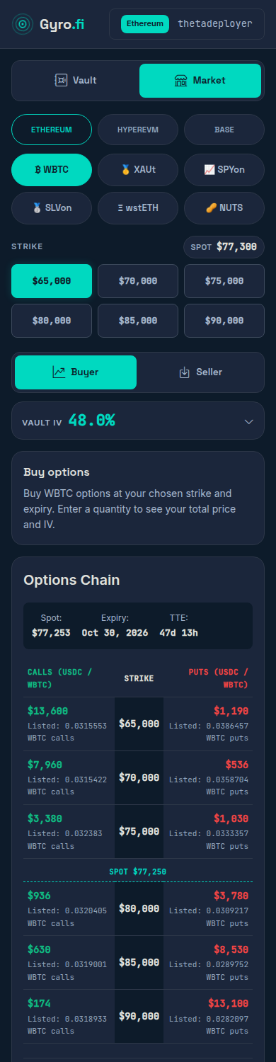
The catalogue can retain the site's own identity. Here it uses Gyro's navy and teal palette, asset categories and chain labels. Included assets are examples from the configuration; listing availability still needs a live check.
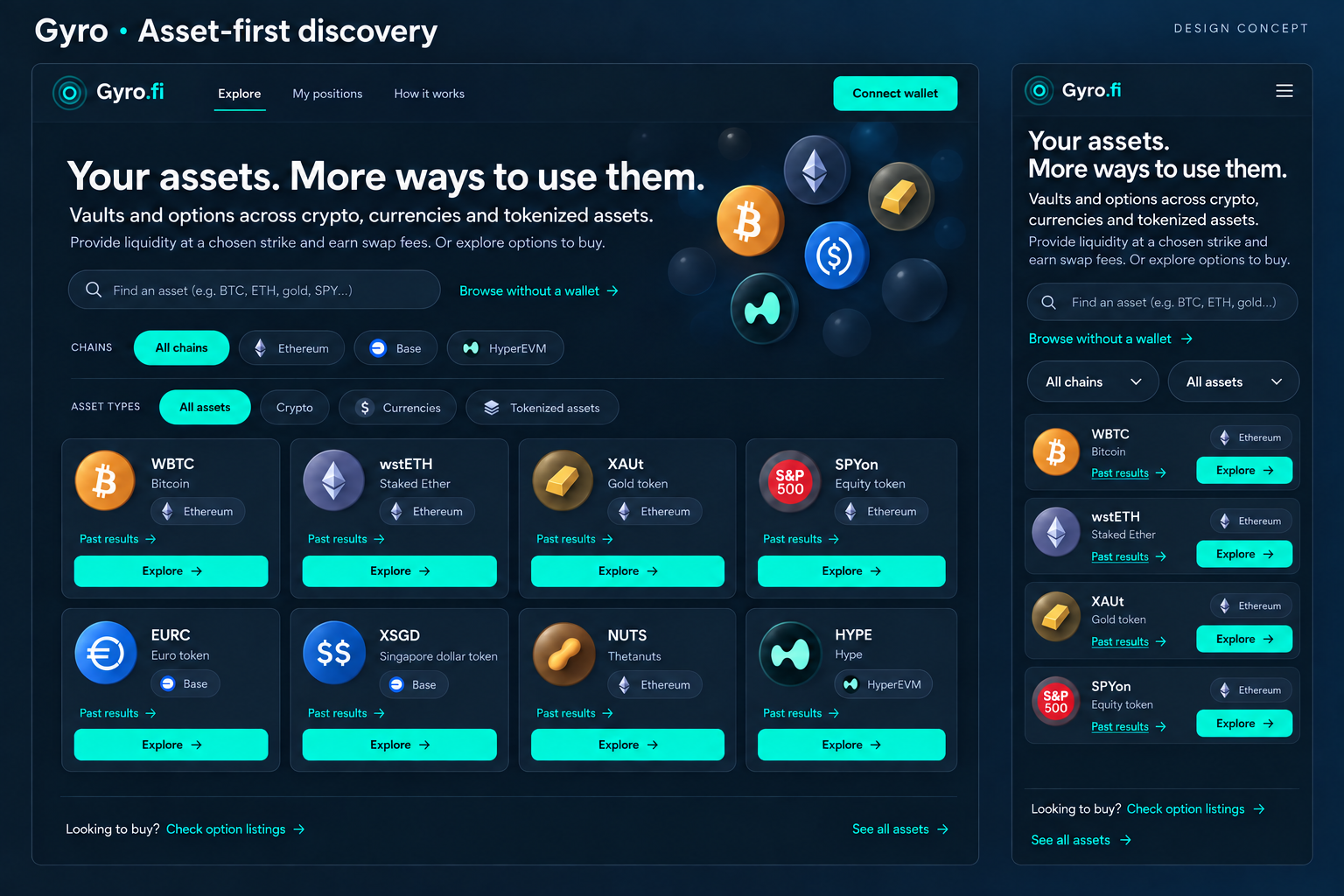
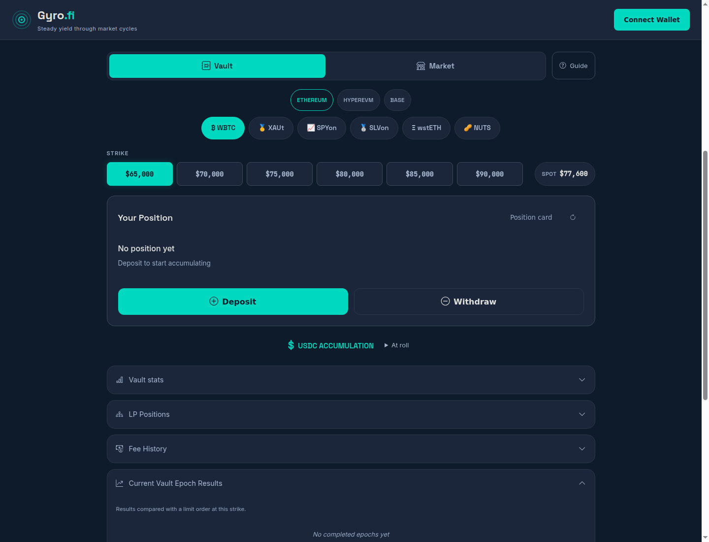
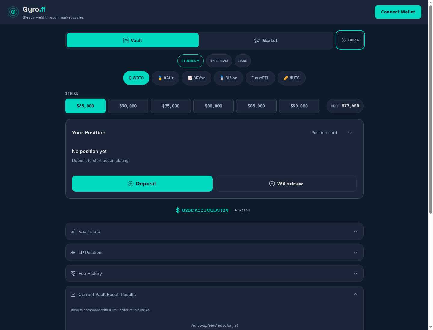
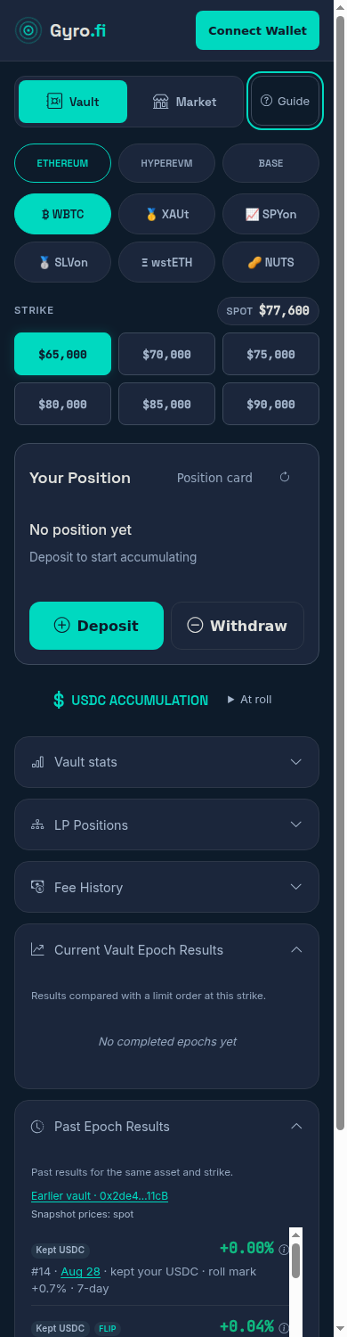
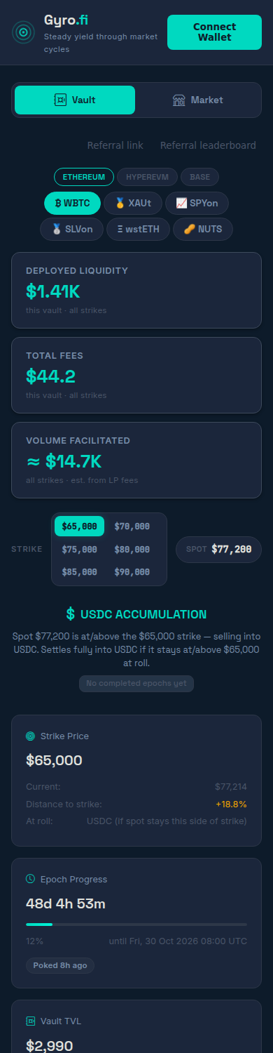
Actual disconnected captures from 3 October. WBTC, Ethereum, $65,000 strike, first-visit guide open.
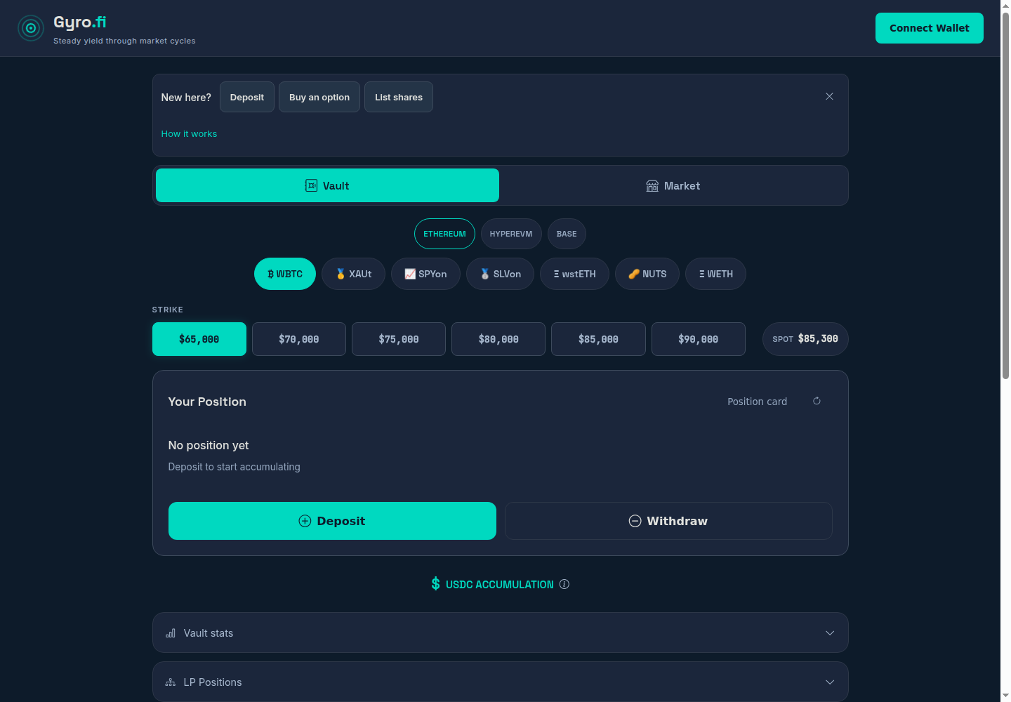
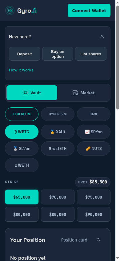
After five seconds, can you say what this site does, spot an asset you know, and choose where to go? Can someone who wants to buy an option find that route without thinking they must deposit first?
Now implemented on Gyro only: an optional first-visit intro, three clear paths and a Guide button for returning users. Eiko and Meryl are unchanged.
Skip or choose a destination to remember the choice in this browser. Existing Gyro users and direct vault links go straight to the app. Guide is always available; no wallet connection is needed to explore.
Recommendation: A’s intent choices, then C’s optional visual walkthrough. Explain what goes in and what the user gets. Keep the normal app path open; no forced tour.
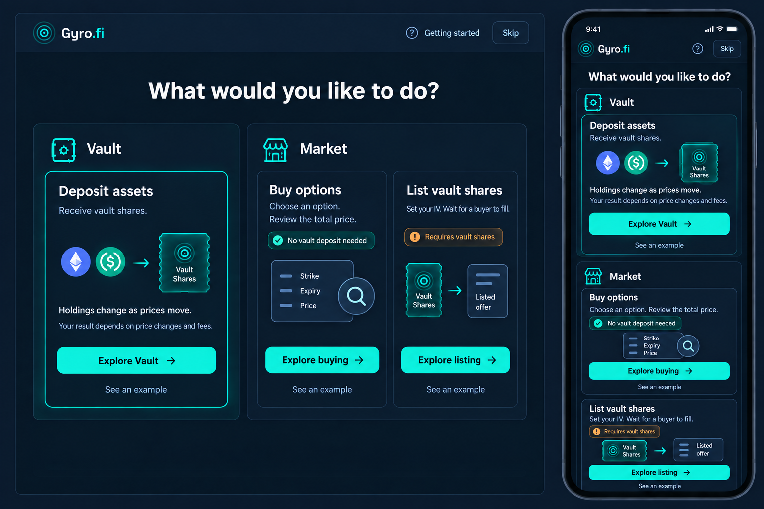
The revision keeps buyer and seller prerequisites on phone and removes the misleading independence claim. The implementation above uses neutral prerequisite labels, generic asset/share diagrams and real CSS-sized controls instead of this raster.
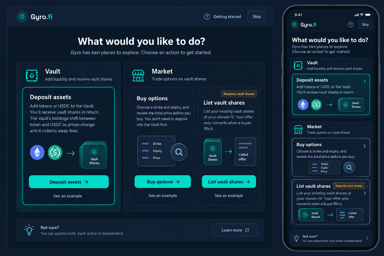
Useful grouping, but too much copy. “Each action is independent” contradicts the seller requirement. Phone drops key cues. These are corrected in the revision above.
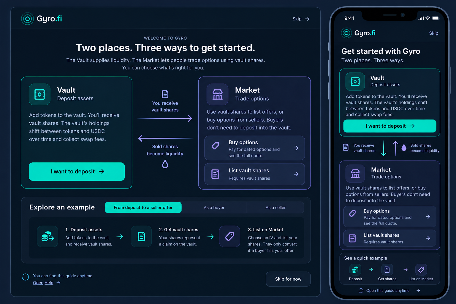
The “sold shares become liquidity” arrow is unsupported. The map can also imply that a buyer must deposit first. A convincing drawing can teach the wrong model.
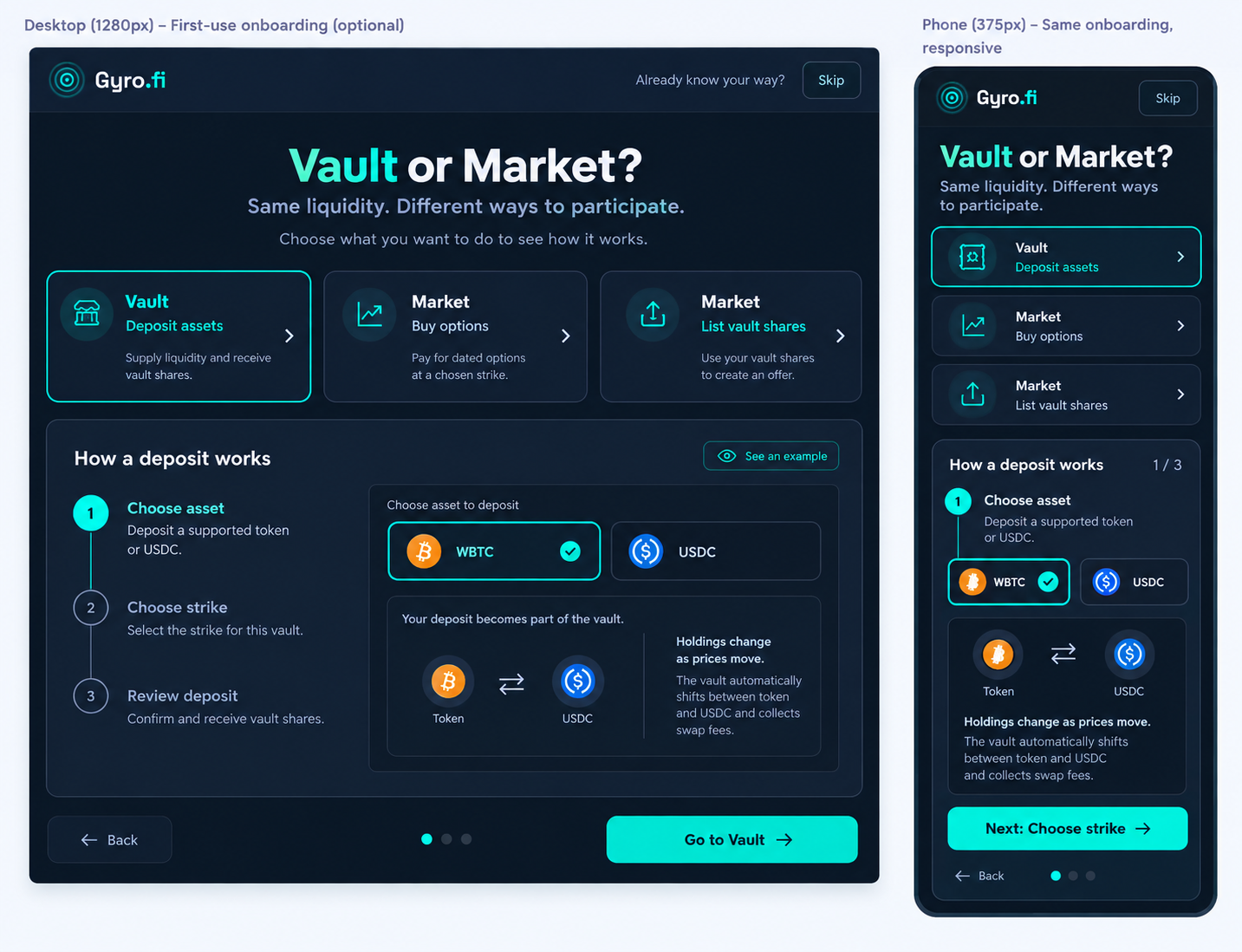
A short example after choosing a role could help. Keep it optional and compact; do not add a second transaction form or made-up quote.
| I want to… | Where I go | Key distinction |
|---|---|---|
| Deposit assets | Vault | Receive vault shares. Holdings change as the vault trades. |
| Buy an option | Market → Buyer | No vault deposit needed. Review the total price. |
| List my vault shares | Market → Seller | Requires vault shares. An option is created only when a buyer fills the offer. |
Ask a newcomer where they would start for each action, without coaching. Can they distinguish vault shares from options? Do they know that listing does not mean a buyer has filled it? Record hesitation and wrong turns before making a live change.
Built-in imagegen supplied the proposals. Fresh Astra reviewed the role semantics and implementation. Generated images remain concepts; the actual app captures are above. Usability still needs the newcomer scenario test. Eiko and Meryl retain their own flows and styles.
A’s position grouping, with C’s quieter hierarchy. Larger holdings, fewer nested boxes and faster access to seller controls.
Three imagegen directions for vault holders, passive sellers and active buyers → practical updates → fresh screenshot-diff review → final refinements. Images marked “proposal” are design ideas, not product data. Real captures use the public thetadeployer account; balances can move between captures.
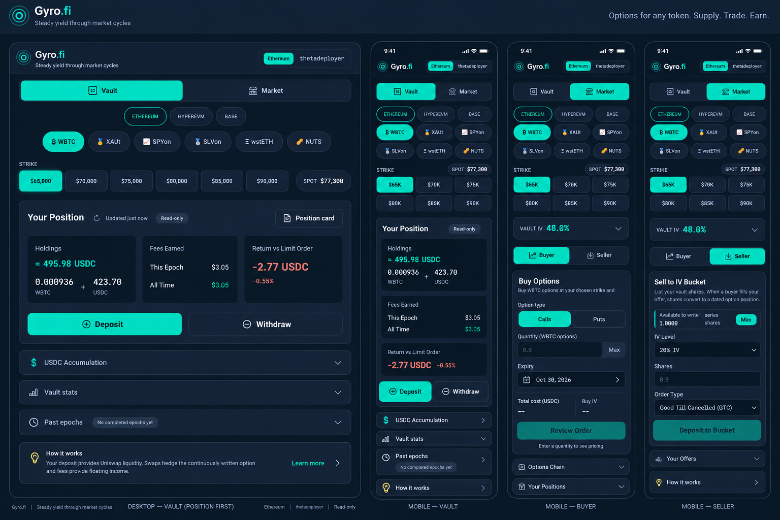
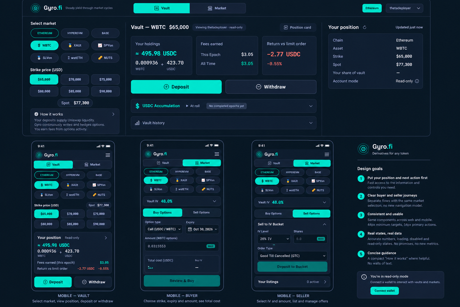
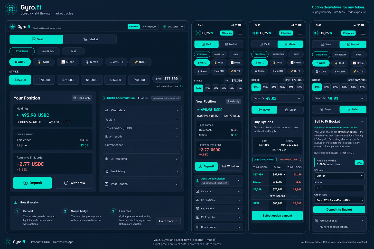
Kept: clearer holdings, less framing, concise guidance and visible actions. Rejected: invented records, missing controls, tiny targets and extra disclaimer panels. Existing brand artwork stays; controls remain real HTML/CSS.
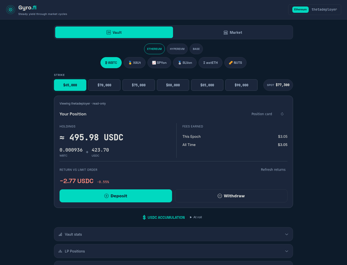
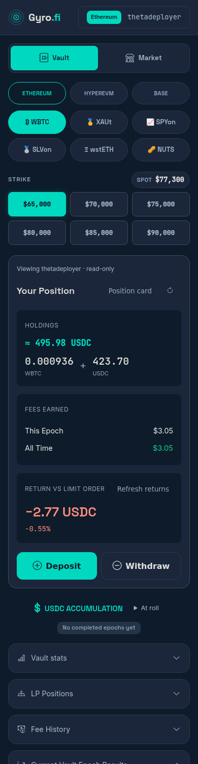
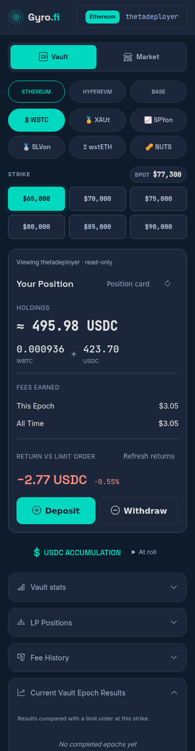
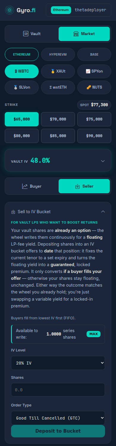
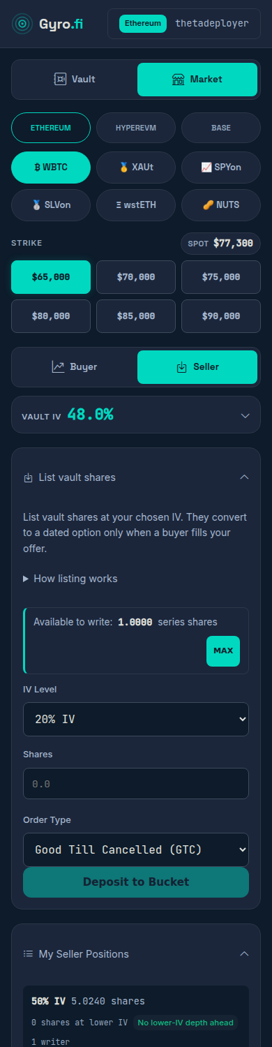
Paused listing now looks and acts disabled. The new submit-only gate follows existing market status; cancellation, claims and withdrawals stay outside it. No quote or return arithmetic changed.
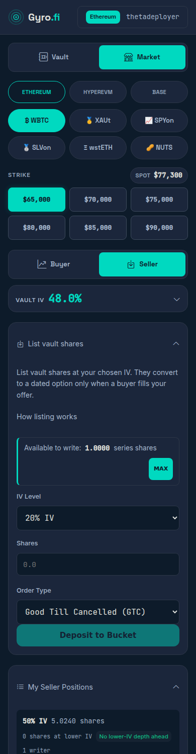
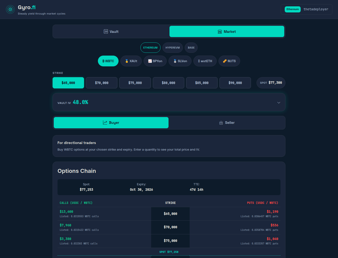
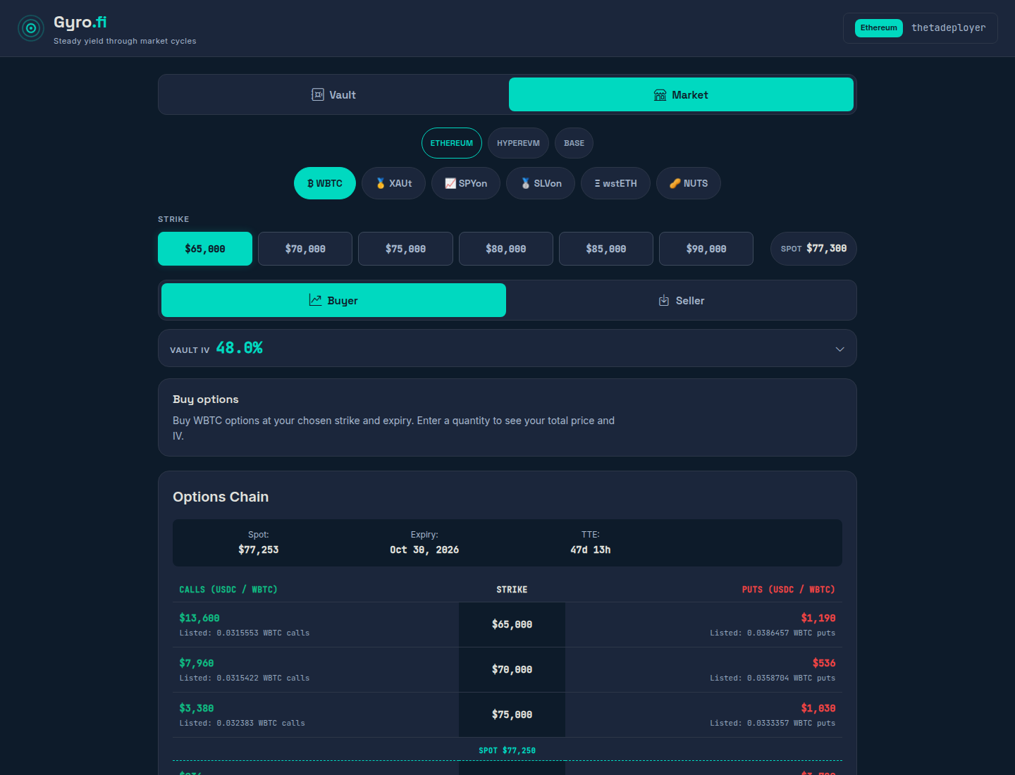
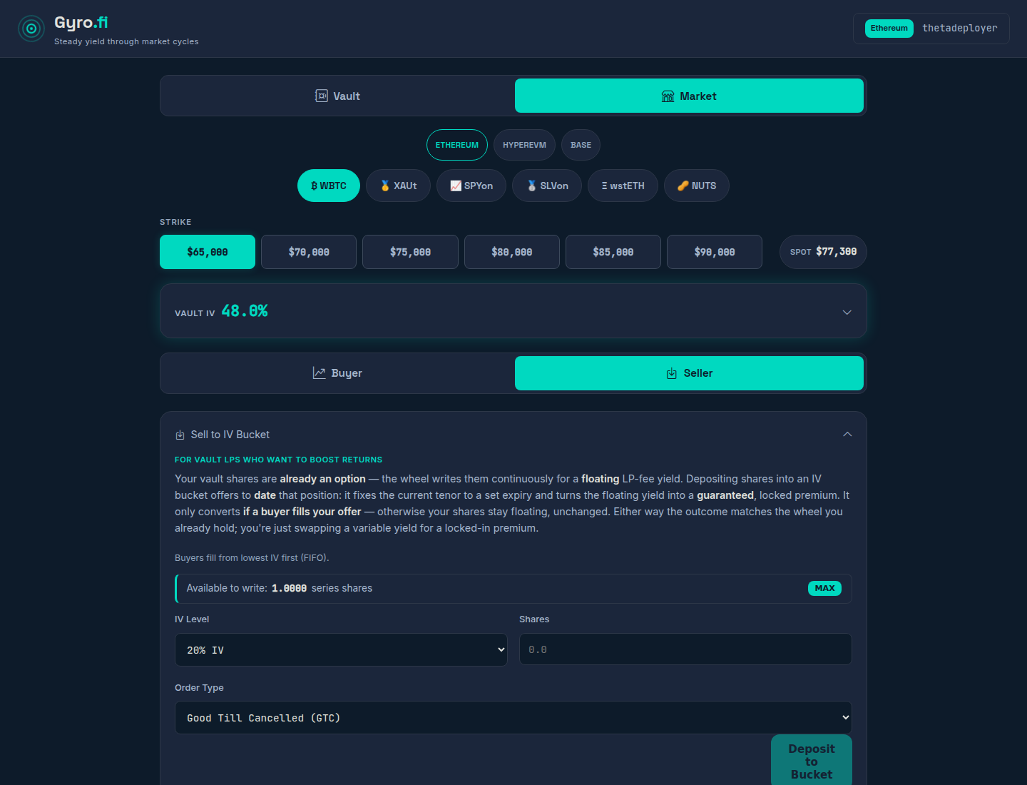
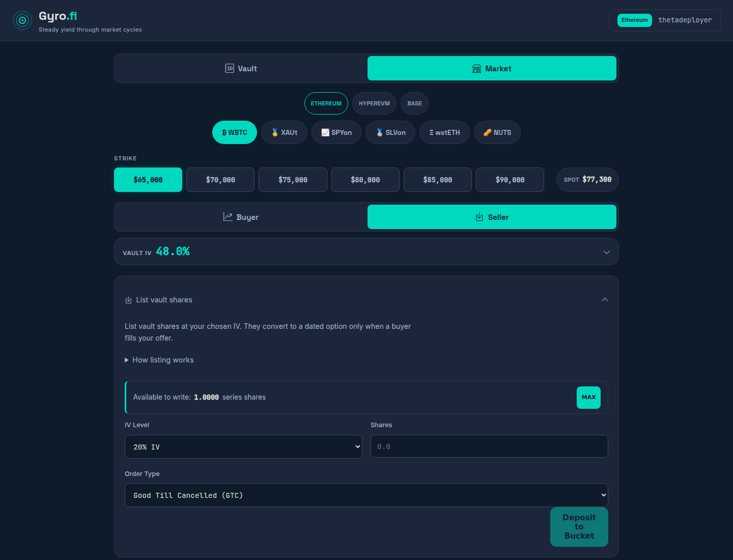
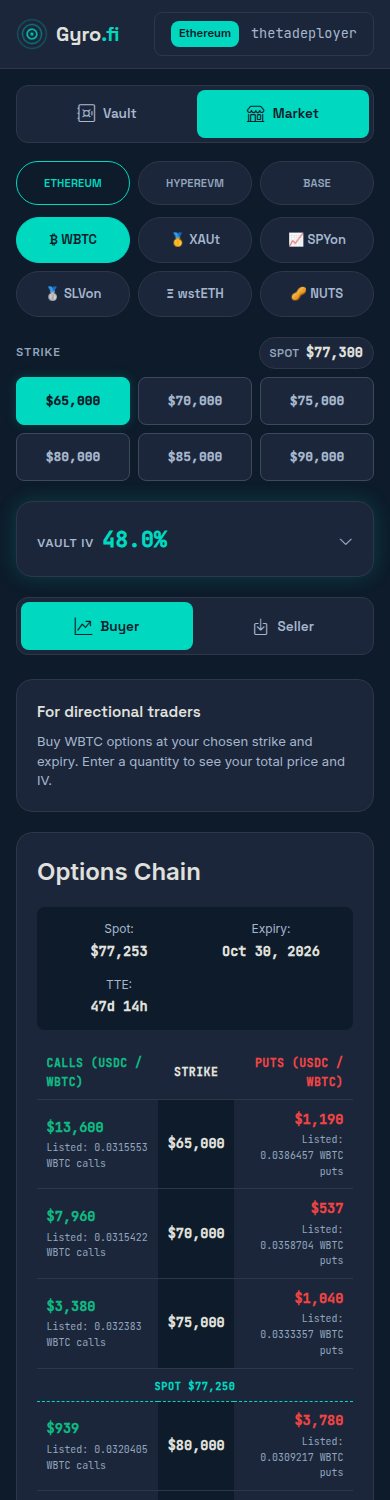
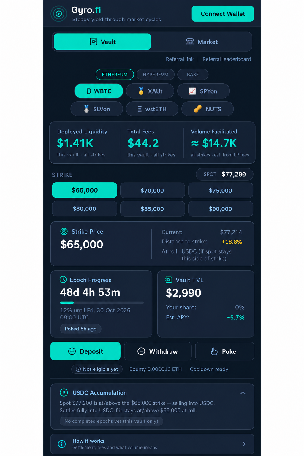
The designer compared actual before/after desktop and phone captures. Only useful refinements were applied; the final screenshots above are the implemented result. Pass 1 desktop · Pass 1 phone · Pass 1 seller.
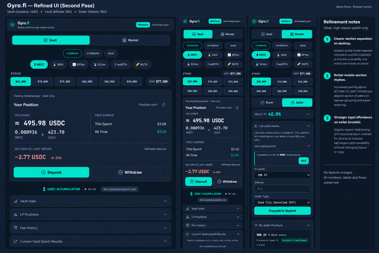
| View | Initial capture | Implemented result |
|---|---|---|
| Vault · desktop | Before | Final |
| Buyer · desktop | Before | Final |
| Seller · desktop | Before | Final |
| Vault · phone | Before | Final |
| Buyer · phone | Before | Final |
| Seller · phone | Before | Final |
Fresh Astra review and targeted regression tests cover control bindings, frozen beta, responsive targets, modal/history visibility and pause-state recovery. Live checks are read-only; no transaction was signed.
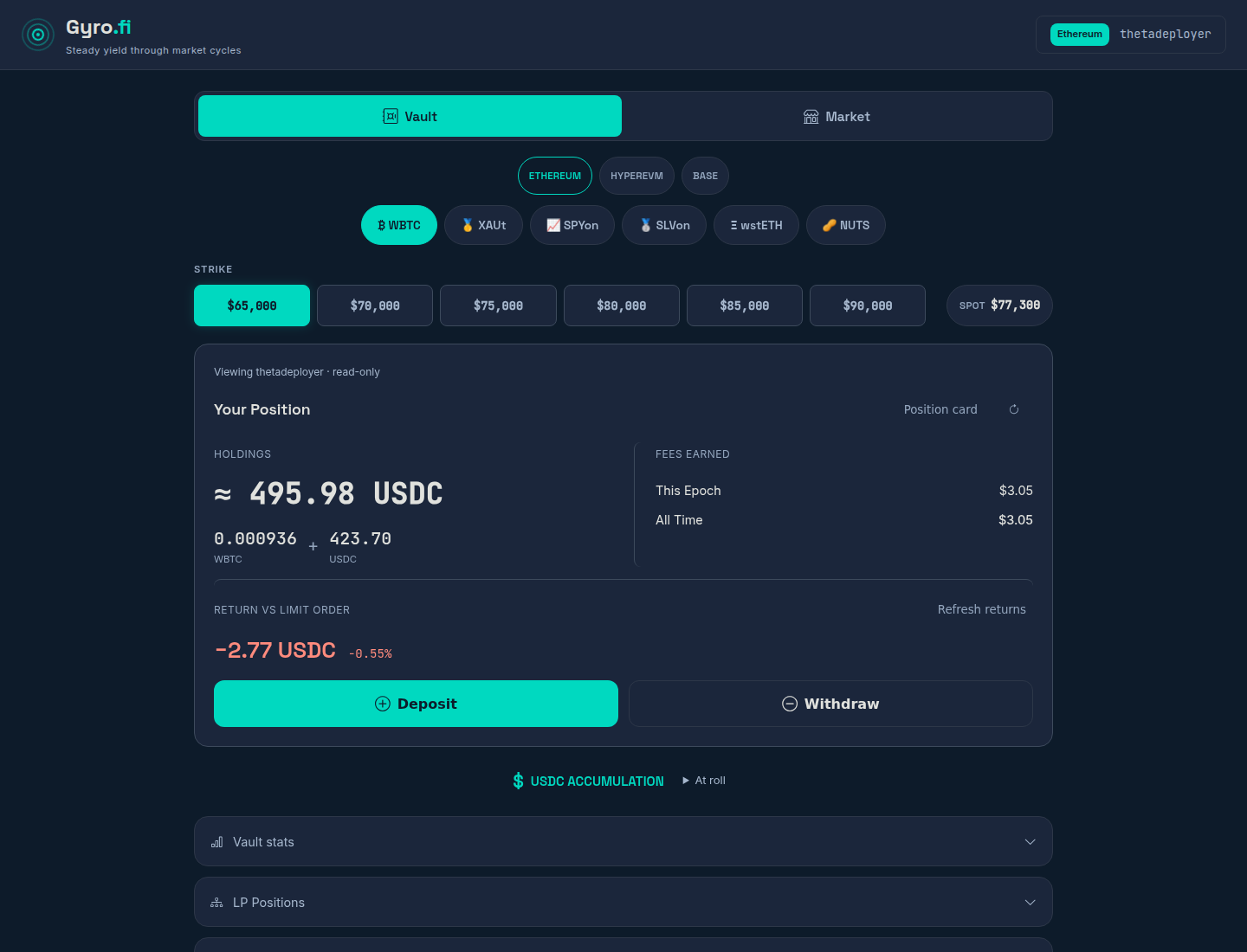
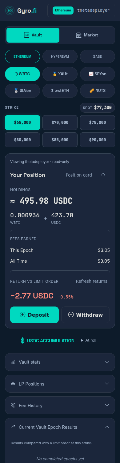
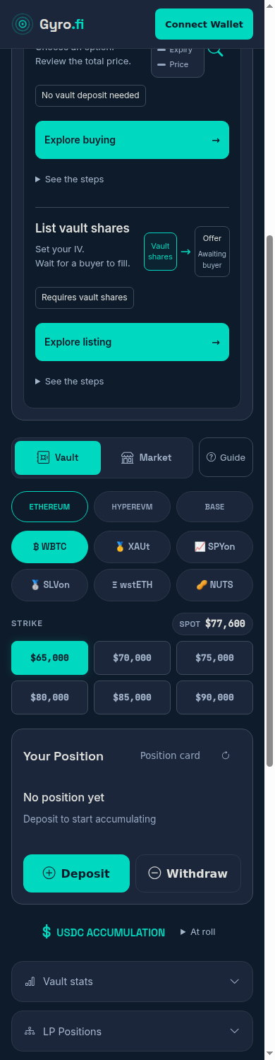
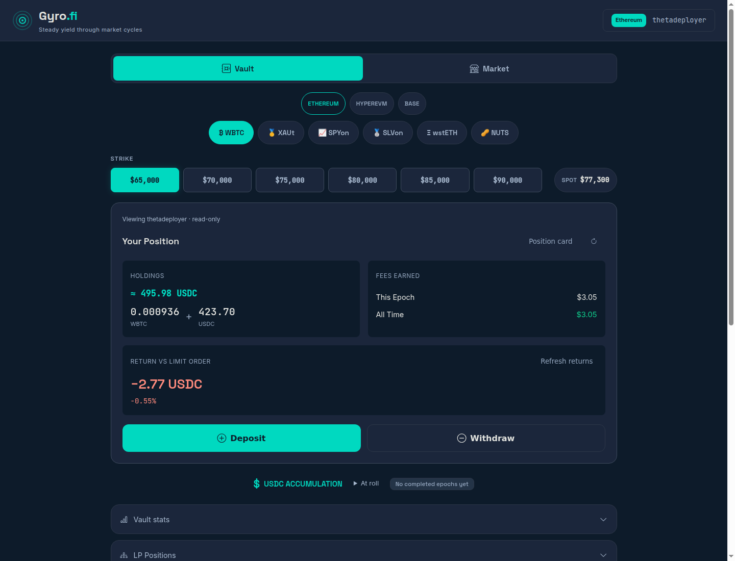
The final layout is live in Gyro. Your position and actions come first; vault-wide stats are folded away. Compare desktop and mobile below. On narrow screens, swipe across each comparison.
Initial and final captures use the same WBTC $65,000 view, disconnected. Values were read at different times; none were altered for the design. Imagegen is a visual proposal, not app data.
Wider content, aligned strikes, brighter labels and a leading position card. Deposit/Withdraw stay large; secondary stats no longer push them down.
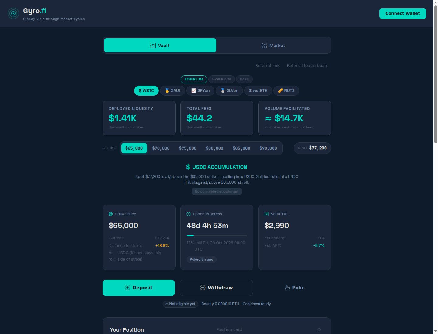
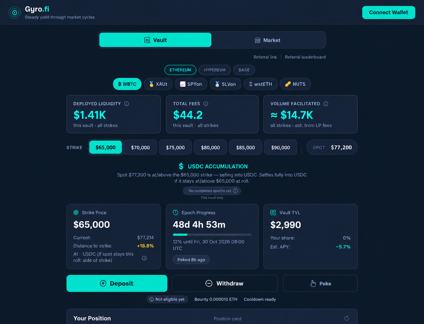

Large action buttons and improved density. Your position, returns and Deposit/Withdraw now come before the folded “Vault stats”. The final capture is a real 390px layout, not a scaled concept.

Open thetadeployer’s read-only view. Live holdings and returns, not sample balances. URL flag: demo=1. No wallet connection or signing.


| Change | Decision | Practicality |
|---|---|---|
| Brighter secondary labels and available chain/asset controls | Done | Gyro-owned colour tokens; disabled and hidden states retained. |
| Equal strike targets and aligned spot | Done | Existing opt-in selector, 44px or larger tap targets, NUTS decimal prices checked. |
| Wider desktop content; less empty vertical space | Done | 1040px content limit; Markets and modal checks included. |
| Your position and returns before vault-wide stats | Done | Personal details first. Liquidity, total fees and volume are in closed “Vault stats”. |
| Large Deposit/Withdraw buttons and denser supporting content | Done | 54px action buttons beside each other. Existing controls and entry gates, no duplicates. |
| Secondary Poke/referrals; expandable settlement detail | Done | Poke inside Vault stats, referrals below the tab content, settlement detail under “At roll”. |
| Extra glow, generic info icons, duplicate “How it works” panel | Skip | More clutter or new unexplained controls; no practical benefit demonstrated. |
Implemented as a Gyro-owned HTML layout and stylesheet. The shared engine, return calculations, deposit/withdraw logic and Eiko/Meryl skins are unchanged. Minimum-deposit validation remains a separate queued fix.