A2 · Two doors on every asset
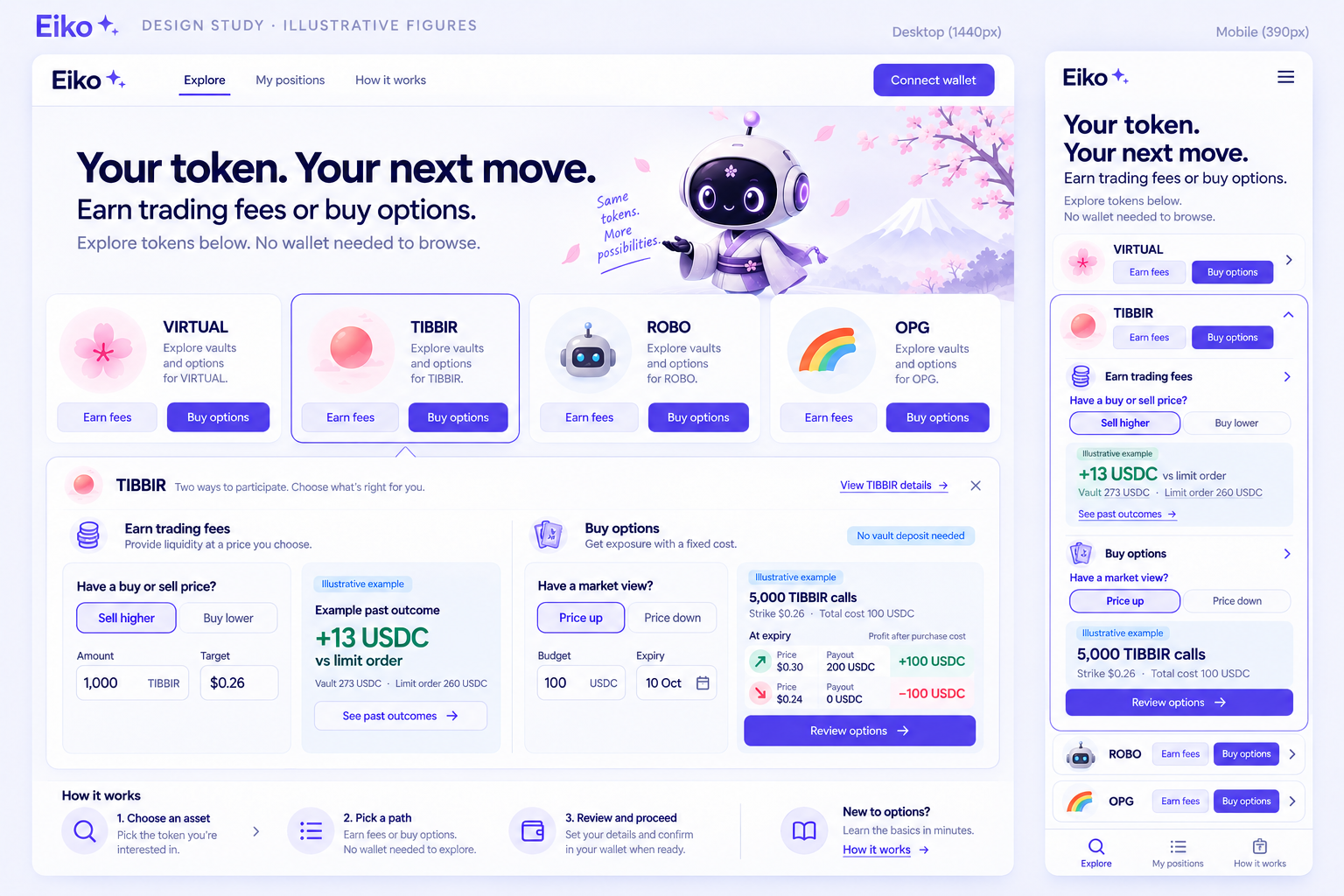
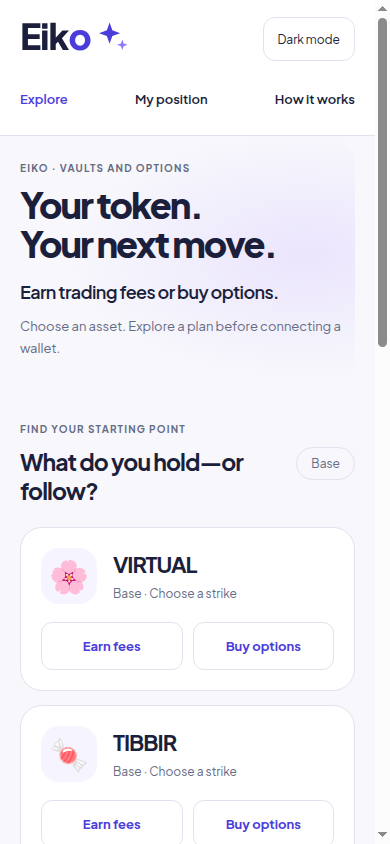
Keeps the catalogue. Each asset offers Earn fees and Buy options; a selected card opens the next step.
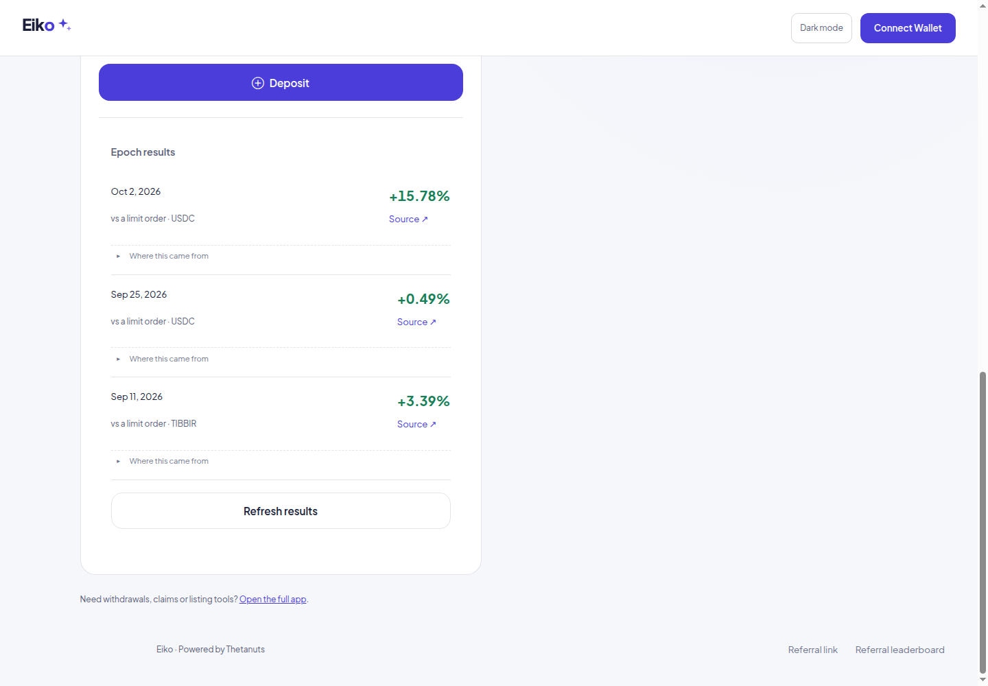
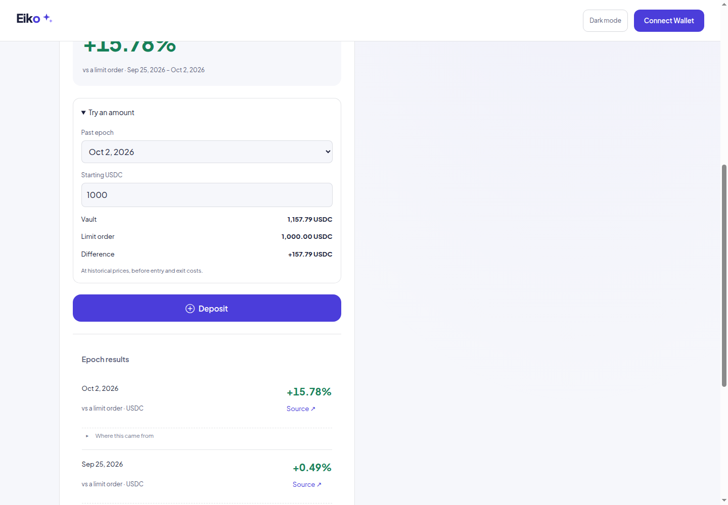
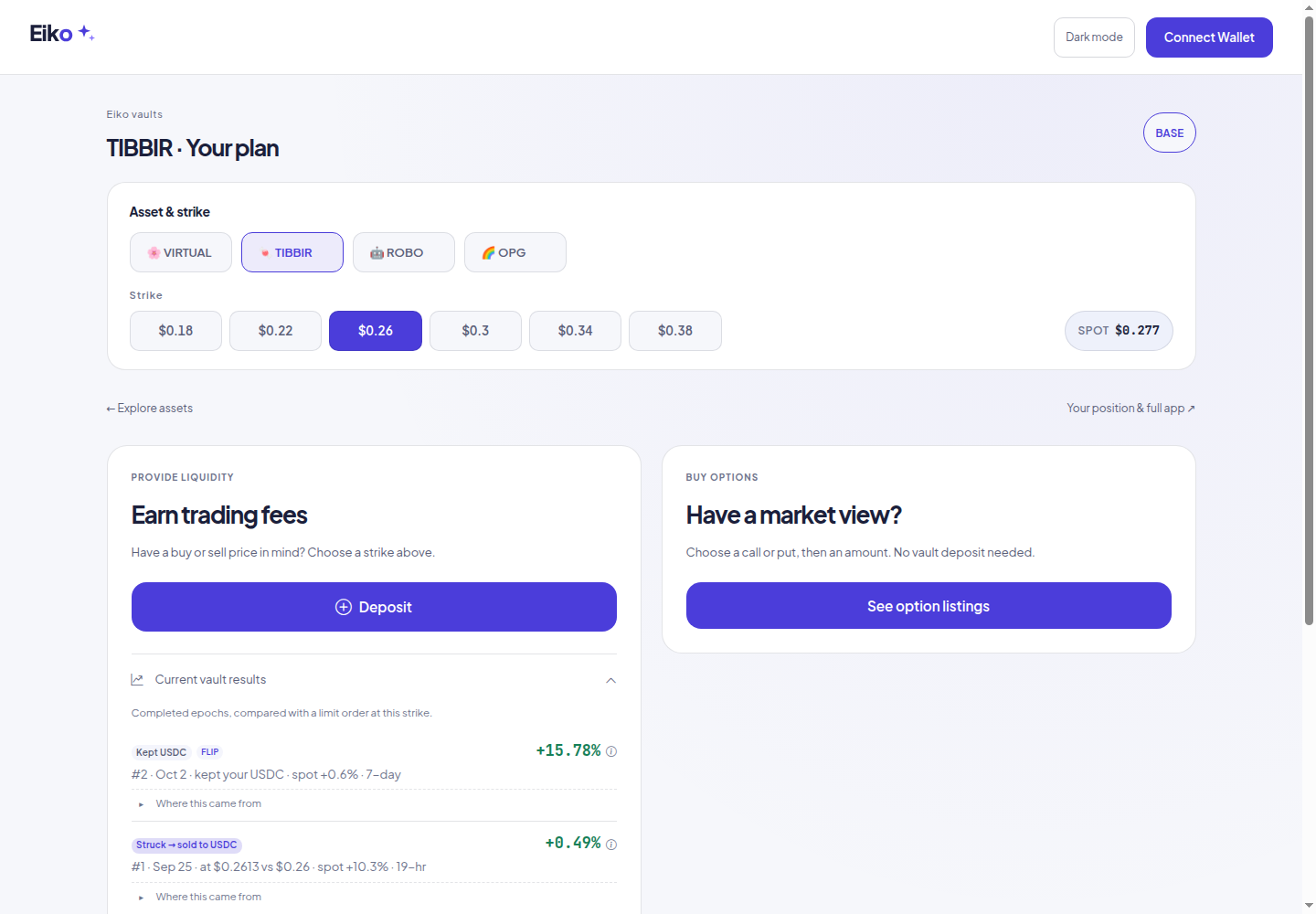
Current and earlier vault epochs now share one newest-first list. Each result keeps its own source. “Try an amount” compares a starting amount with a limit order for one recorded epoch.
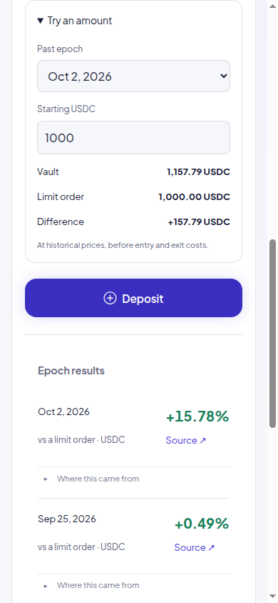
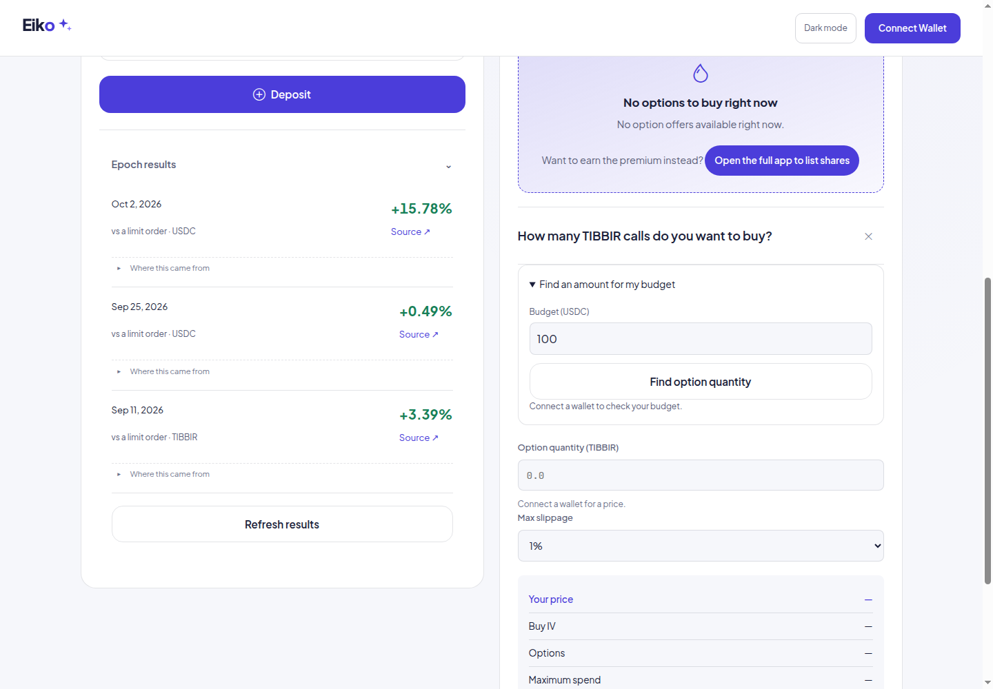
After selecting a listed call or put, open “Find an amount for my budget”. It needs a connected wallet and checks executable prices. The quantity is then priced again for review, with the budget retained as a spending cap.
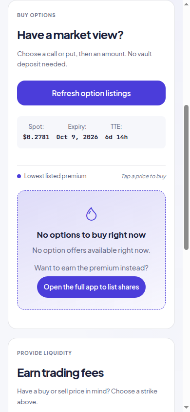
TIBBIR had no buy offers during this check. Its vault reported paused on-chain; Markets itself was not paused. Neither flag was changed. Budget control preview → was opened directly for layout and disconnected-state testing; it is not a successful trade quote.
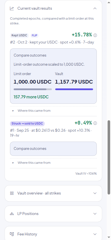
Earn fees now opens with the last completed epoch, its dates and the limit-order comparison. Deposit opens the form only when selected.
Saved historical results stay visible with “Updating…” while recent data loads. Current fees, wallet balances and trade quotes still require fresh reads. These are actual captures, not generated examples.
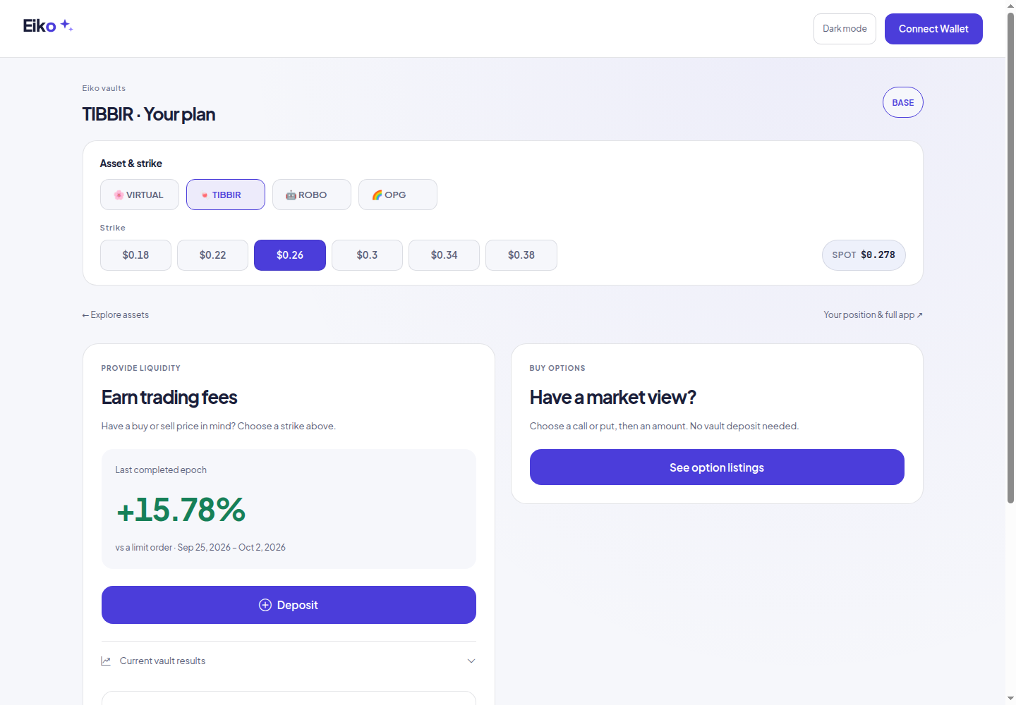
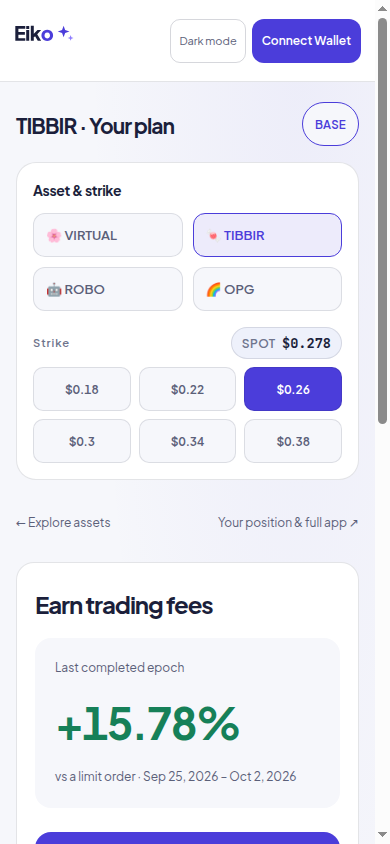
A’s asset catalogue leads into C2’s two-path view. Choose an asset, then earn trading fees or buy options. The existing app controls, live reads and historical results supply the numbers.
This first version reuses the deposit form and option-quantity quote. The personal-amount historical replay and budget-to-option calculator are not included yet. TIBBIR returned no buy offers during this check, so the buyer capture shows the actual empty state.
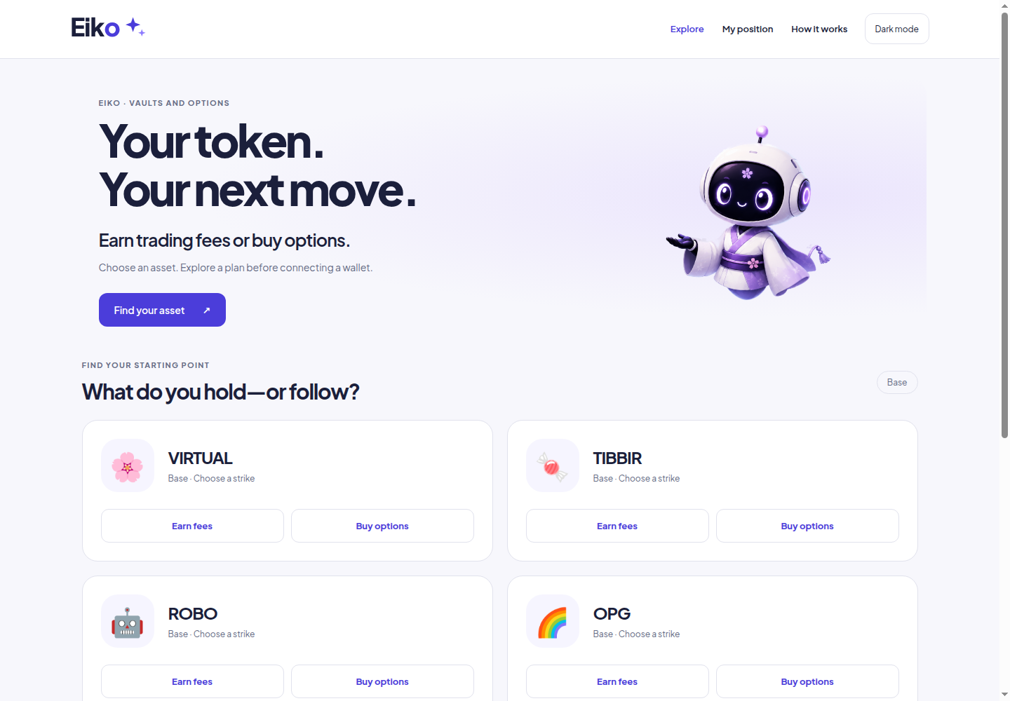
The full app remains available for positions, withdrawals, claims and seller tools. Eiko only; the other subDAO designs and Eiko beta are unchanged.
Keep the asset catalogue, but give both customers a clear route. A depositor sees a past comparison with a limit order. An options buyer sees the purchase cost and outcomes at different expiry prices.
Design simulations only. All money figures in this round are hypothetical examples—not live quotes, actual historical returns or contract simulations. No app flow has changed.
Keeps the catalogue. Each asset offers Earn fees and Buy options; a selected card opens the next step.
A single Earn/Buy switch changes the catalogue. Each view shows only the numbers relevant to that customer.
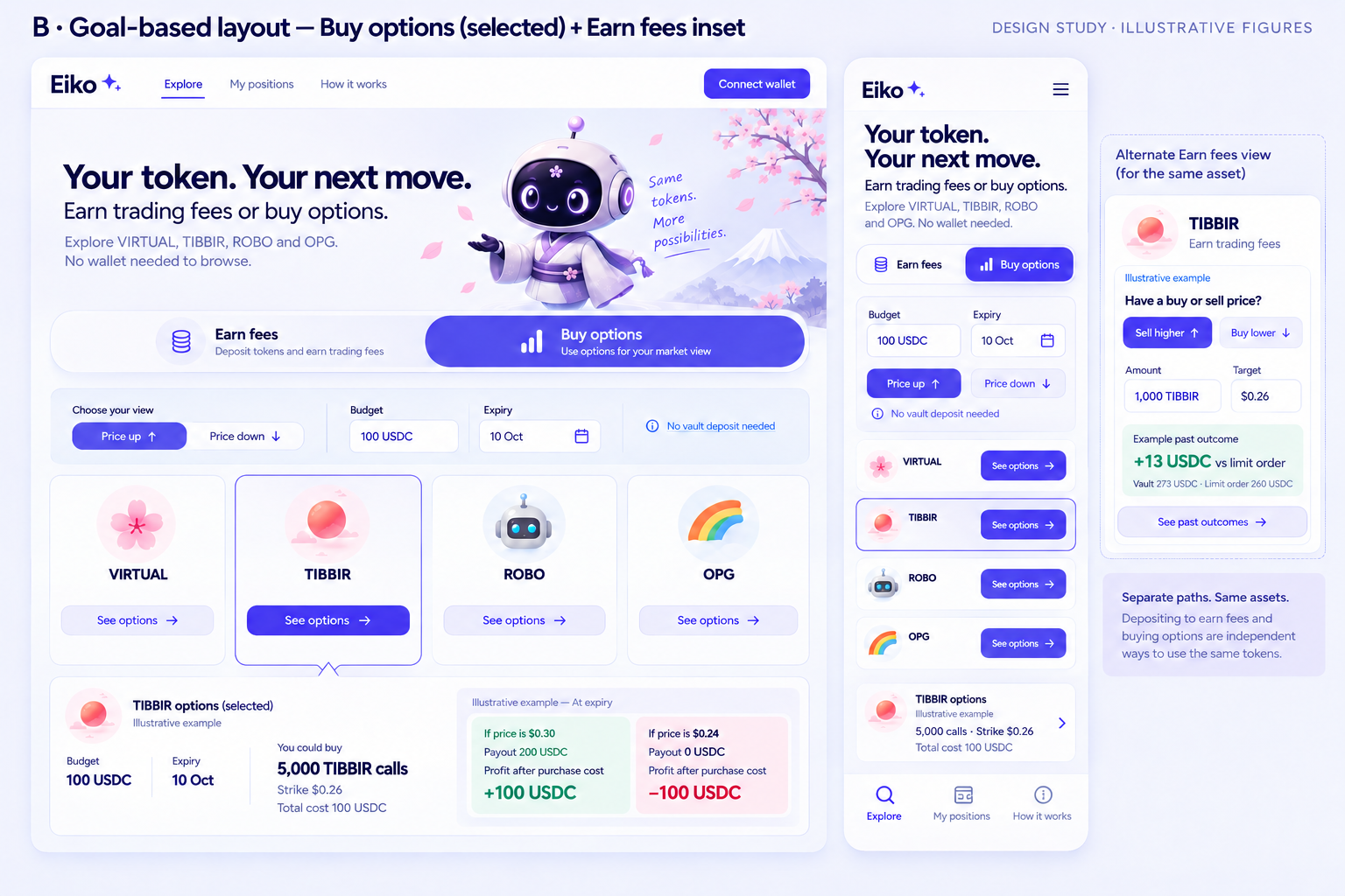
Choose an asset, then compare two clear paths. The forms answer different questions without mixing their results.
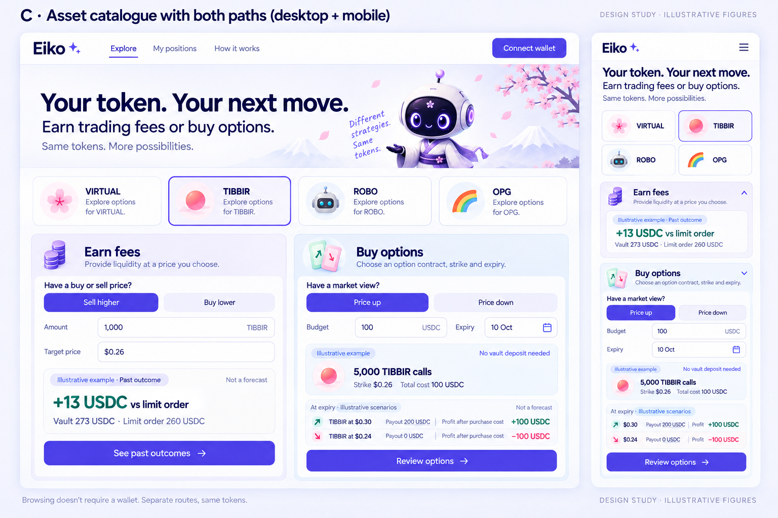
The made-up past-period example ends with 273 USDC from the vault versus 260 USDC from a limit order: 13 USDC more. This is not a forecast or a real TIBBIR record.
The illustrative option costs 100 USDC for 5,000 TIBBIR calls at a $0.26 strike. Under this simple call example, a $0.30 expiry price gives a 200 USDC payout and 100 USDC profit after purchase cost. At $0.24, payout is zero and the loss is 100 USDC. These values do not establish the deployed contract's payoff.
My preference: C2 as the selected-asset view. It connects a plan to a monetary answer most directly. A2 retains the catalogue best; B2 separates the two audiences most cleanly. The notes flag missing phone details and copy to tighten before implementation.
Can a holder find a plan for their tokens? Can a buyer immediately find the cost of an option, without being routed through a vault deposit? Which version makes the next action clearest?
A new visitor should see what Eiko offers before learning how its controls work. This round tests three entrances: browse an asset, choose a goal, or explore the whole market.
Design proposals only. The live app, deposits and existing landing page are unchanged. These are not live prices or availability indicators.
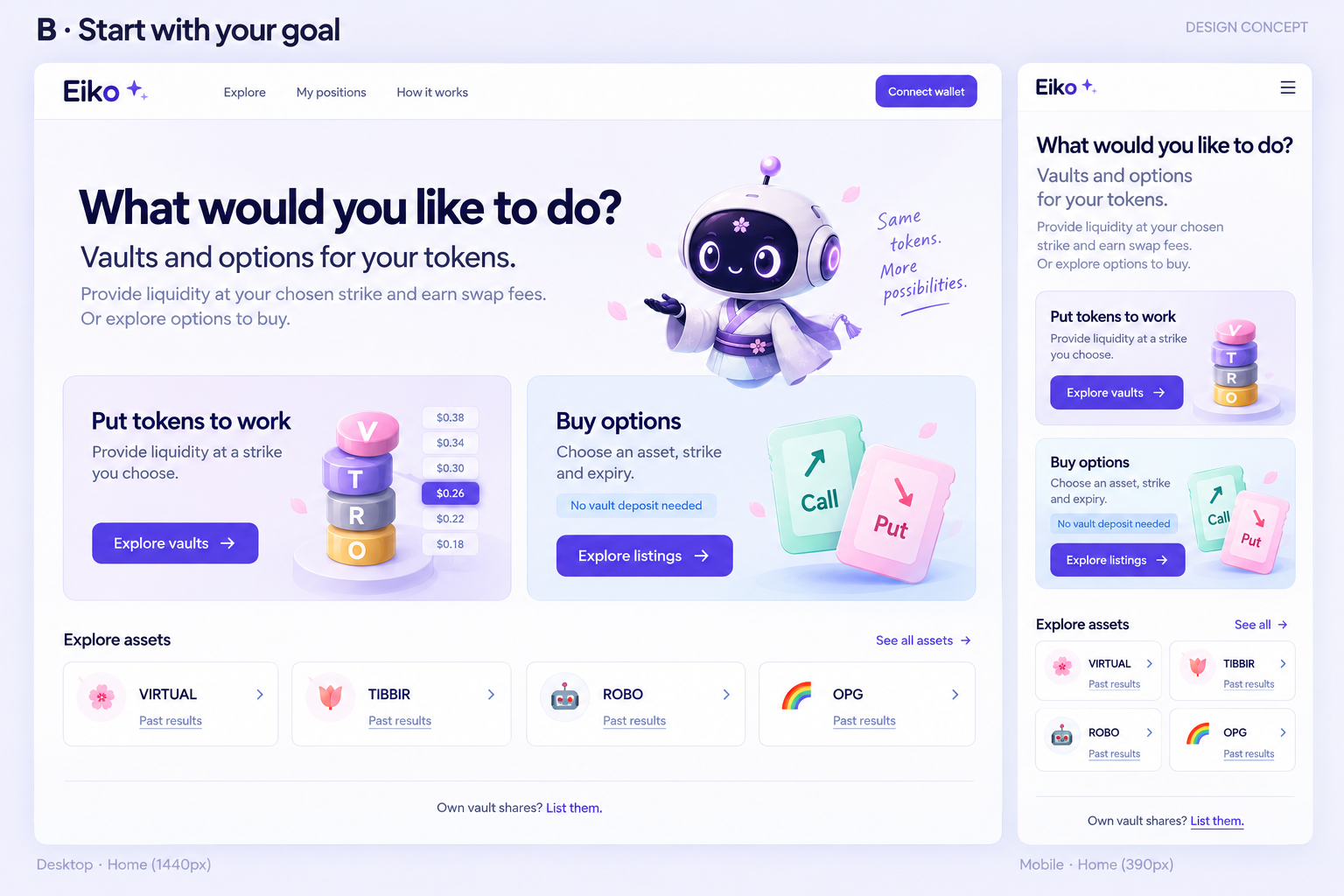
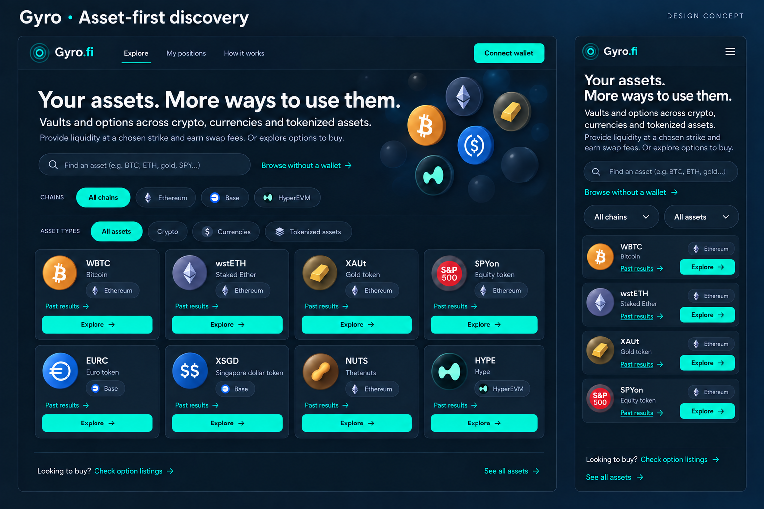
Four assets up front. Best at showing the breadth of the offering. Trim the repeated card copy before building.
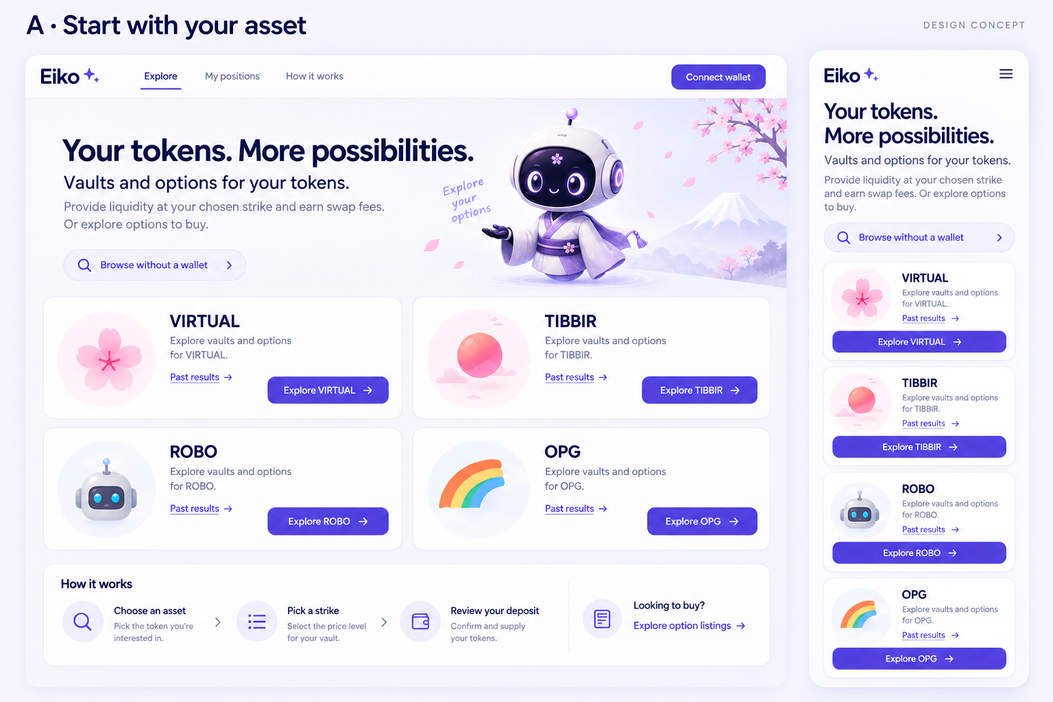
Two clear routes: provide liquidity or buy options. Best at answering what this product does. Asset discovery sits one level lower.
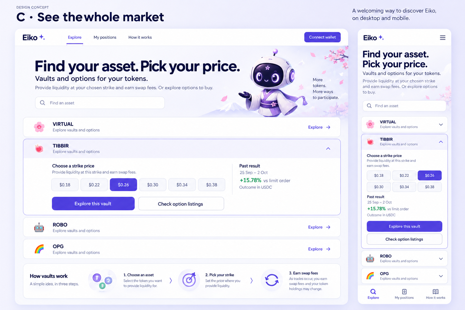
Expand an asset into strikes and past results. Best once the visitor has an asset in mind. More demanding as a first screen.
Starting preference: A. It makes the selection visible quickly. B explains the two routes most clearly; C is a useful direction for the next step after choosing an asset. We have not combined them into a new app.
The catalogue can retain the site's own identity. Here it uses Gyro's navy and teal palette, asset categories and chain labels. Included assets are examples from the configuration; listing availability still needs a live check.
Actual disconnected captures from 3 October. TIBBIR, Base, $0.26 strike.
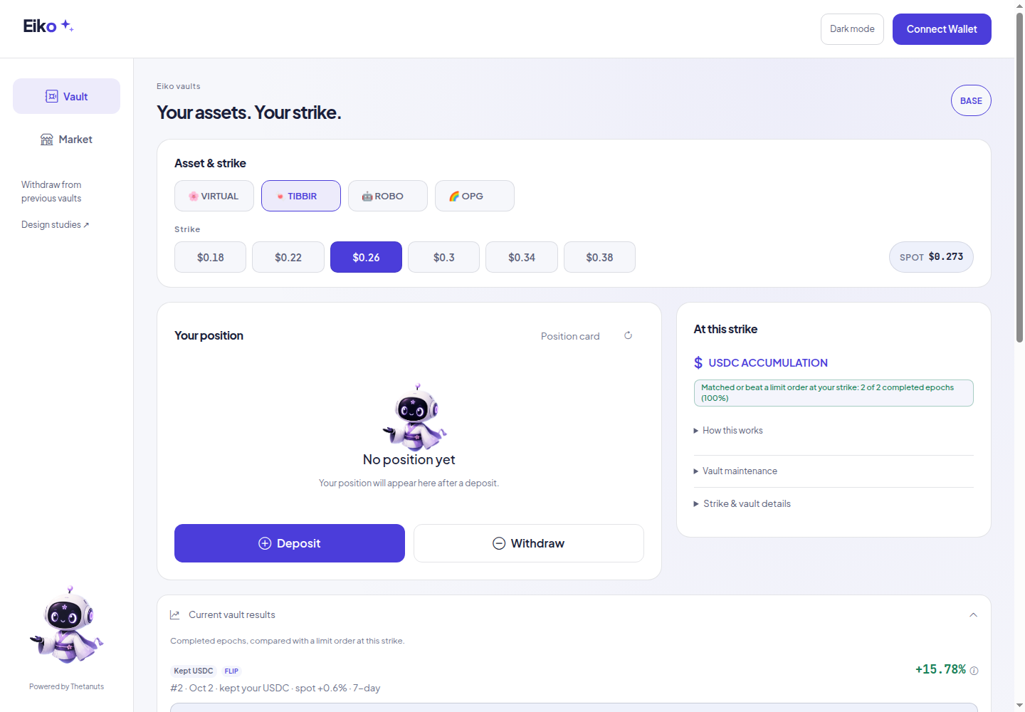
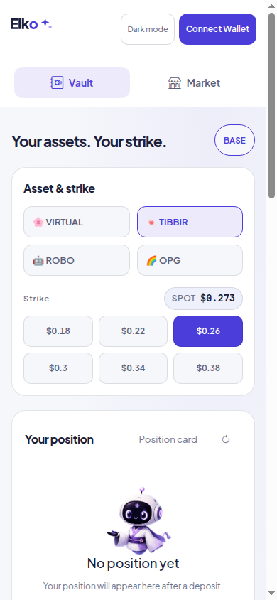
After five seconds, can you say what this site does, spot an asset you know, and choose where to go? Can someone who wants to buy an option find that route without thinking they must deposit first?
How much did the vault leave, compared with a limit order at the same strike? Three imagegen concepts test different ways to answer that question. A is implemented first: two ending amounts, one scale.
The mockups use the owner’s 25 September–2 October examples. The limit-order outcome is scaled to 1,000 units; it is not a 1,000-unit initial deposit or a wallet return. The live app uses its loaded epoch results, including losses. No yield forecast is added.
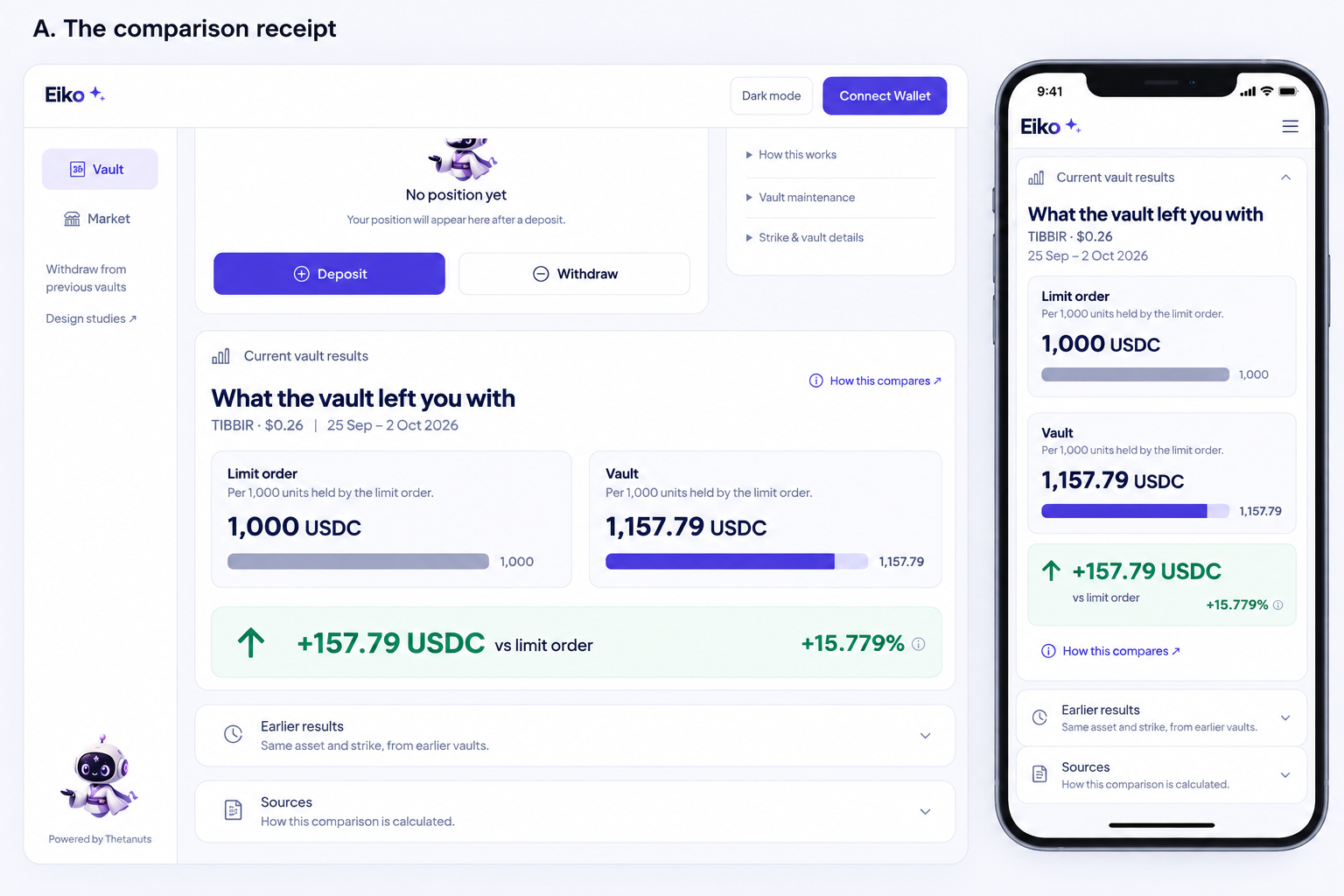
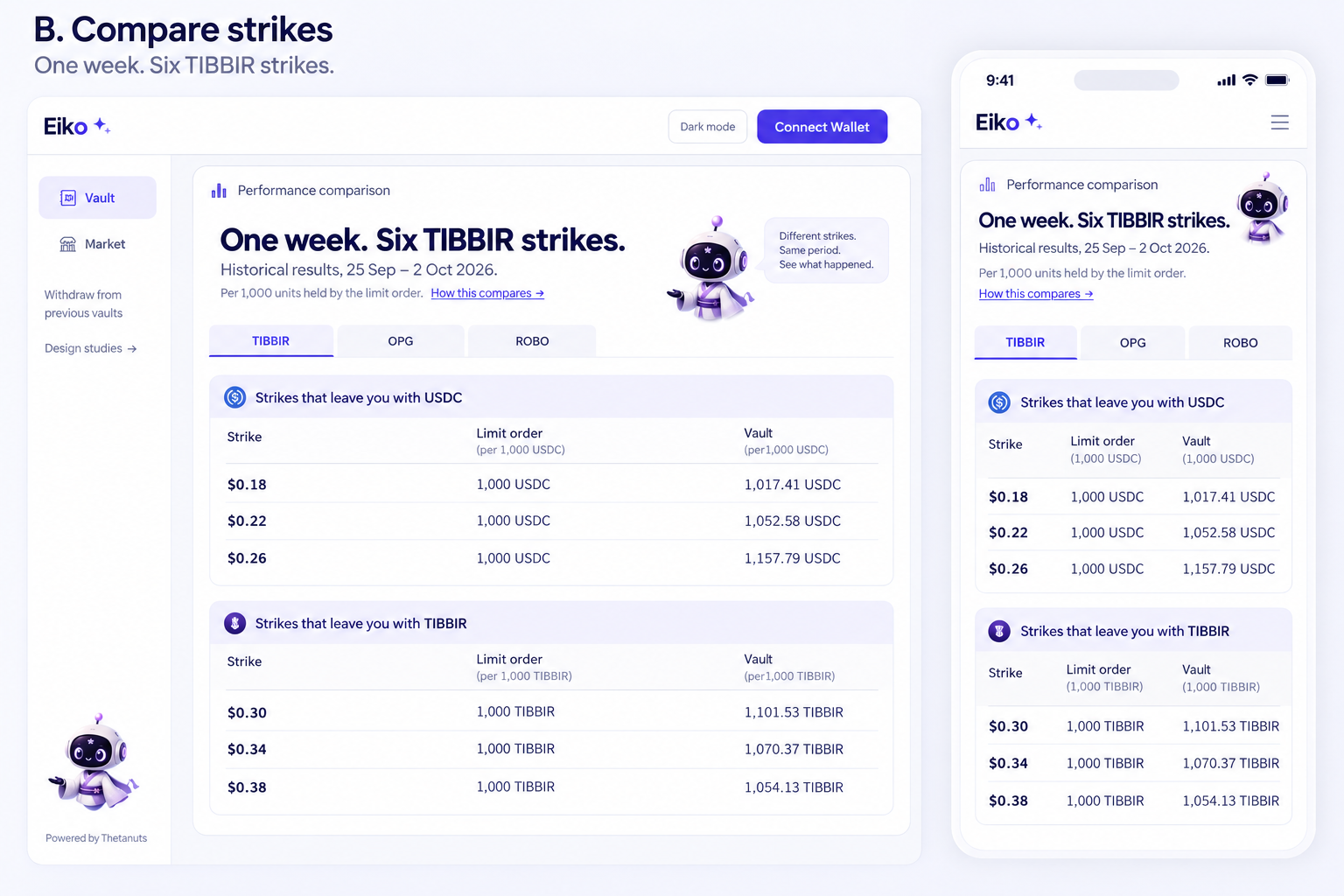
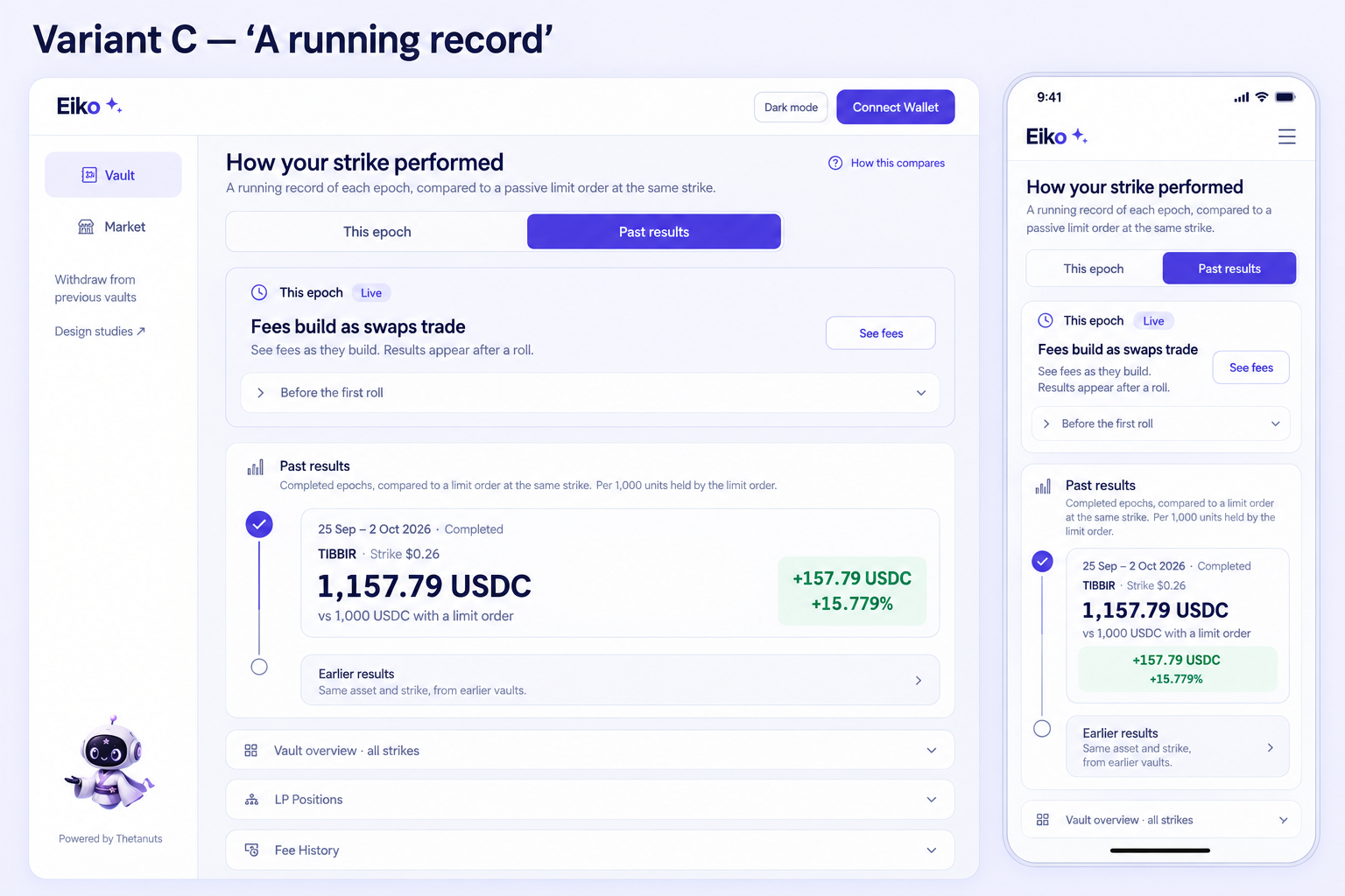
A: the clearest small change. Keep the amount pair, trim repeated copy, and calculate both bar lengths on one scale—the generated bars do not do that correctly. B: useful for comparing strikes, but requires a verified common-period view. C: useful separation of live fees and past outcomes, but too much framing and repeated text for this pass.
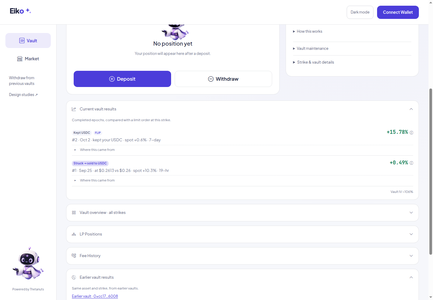
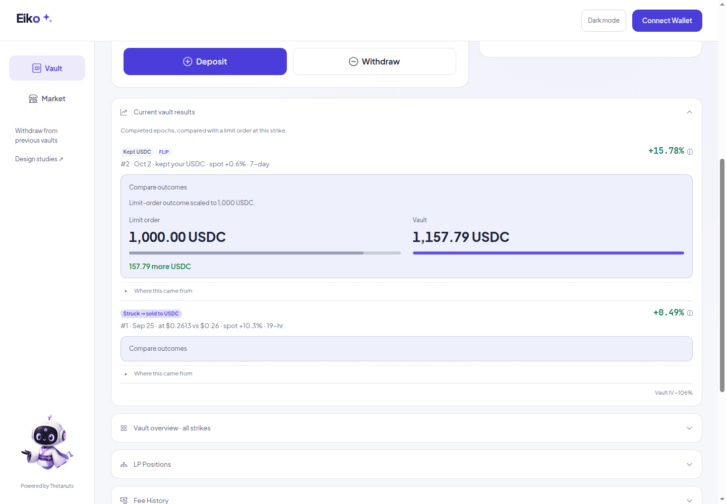
Latest completed comparison starts open; older comparisons open on request. Earlier-vault records form one newest-first list, with addresses and evidence under one closed Sources section. The timeline cleanup also applies to Gyro, Meryl and Merry Wheel. Eiko’s frozen beta is unchanged.
Should a newcomer use Vault or Market? This round tests visual intent choices, a product map and a short optional walkthrough, using Gyro as the shared journey reference. Eiko’s live app and skin are unchanged.
Recommendation: choose by intent first, then offer a small visual example. Buying needs no prior vault deposit; listing requires vault shares. The product-map concept is rejected as drawn because one of its arrows teaches the wrong flow. This is concept review, not a live onboarding release.
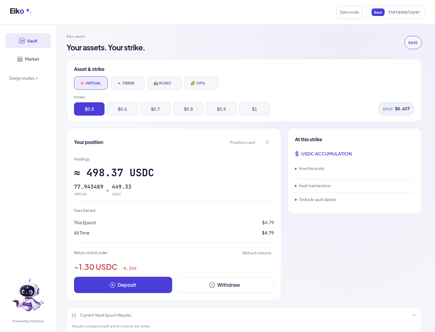
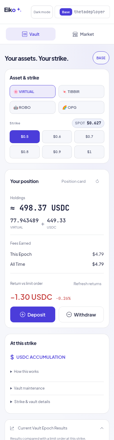
Alpha is now the public app. Position first, compact asset/strike selection, quieter context and the same Eiko engine. Beta stays untouched.
Three imagegen directions for vault holders, passive sellers and active buyers → practical updates → fresh screenshot-diff review → final refinements. Images marked “proposal” are design ideas, not product data. Real captures use the public thetadeployer account; balances can move between captures.
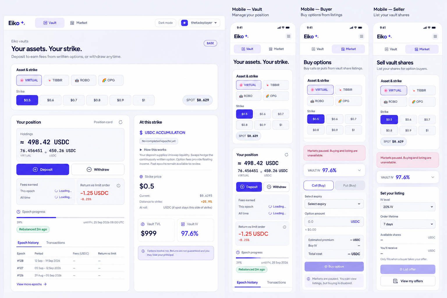
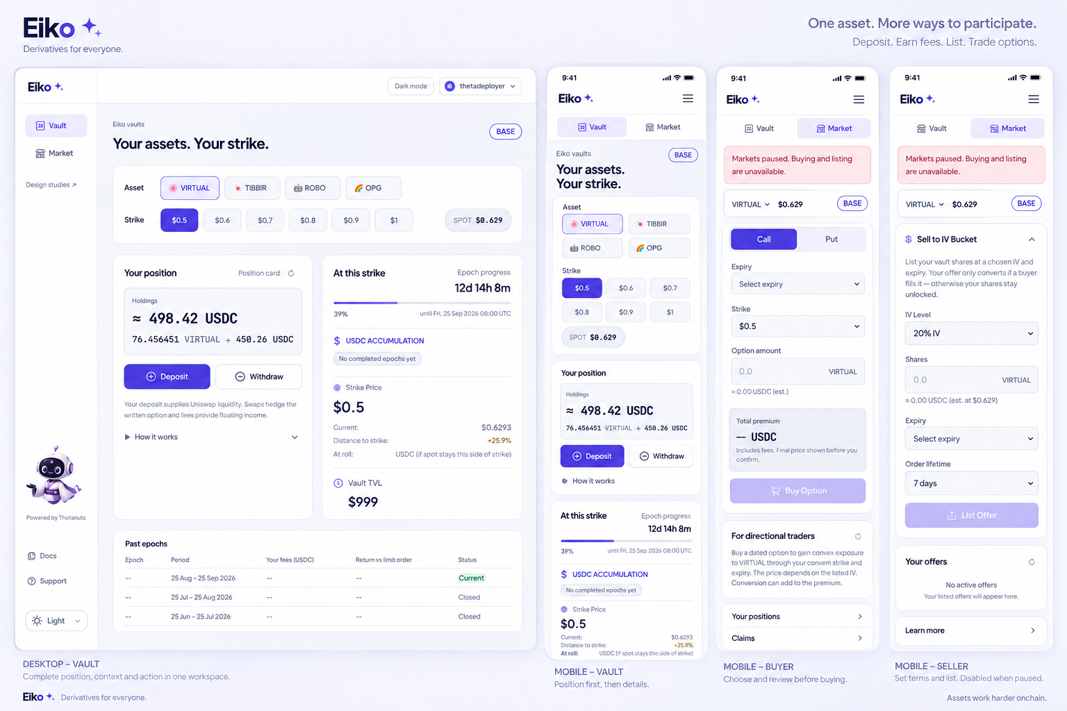
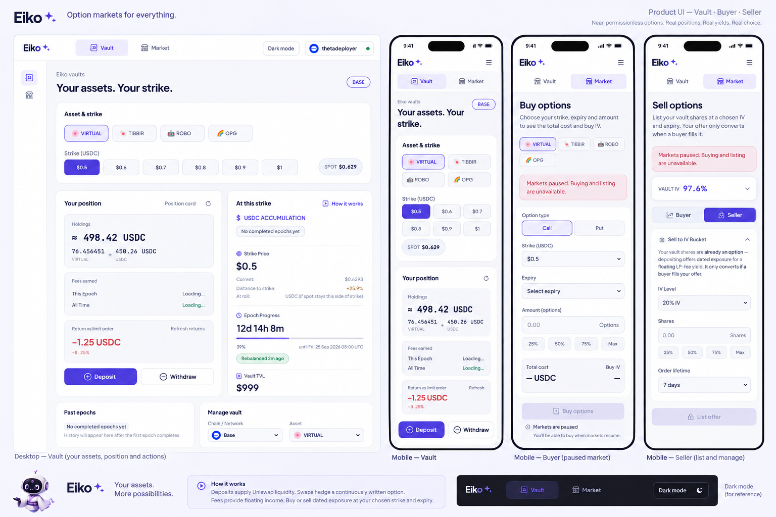
Kept: clearer holdings, less framing, concise guidance and visible actions. Rejected: invented records, missing controls, tiny targets and extra disclaimer panels. Existing brand artwork stays; controls remain real HTML/CSS.
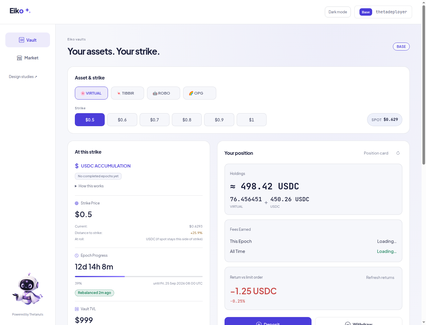
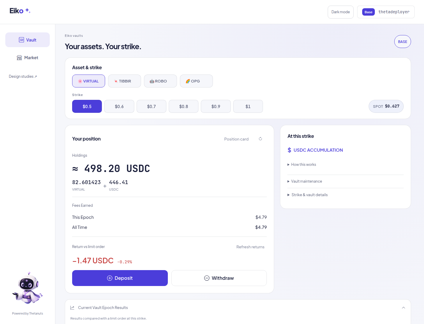
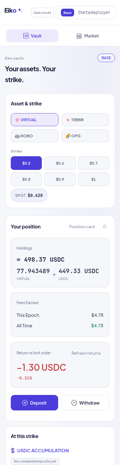
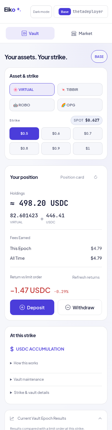
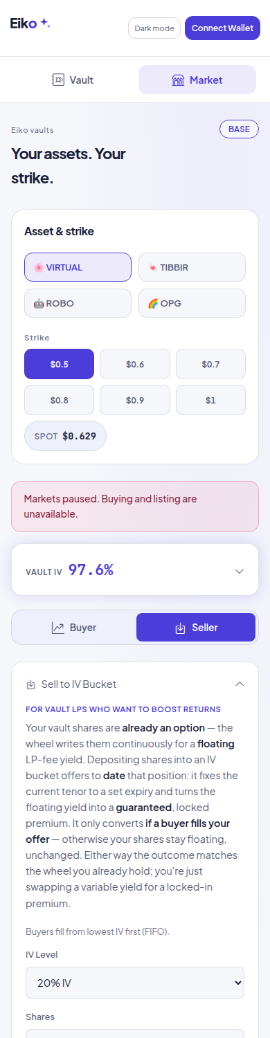
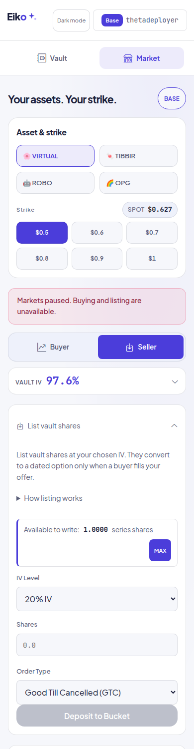
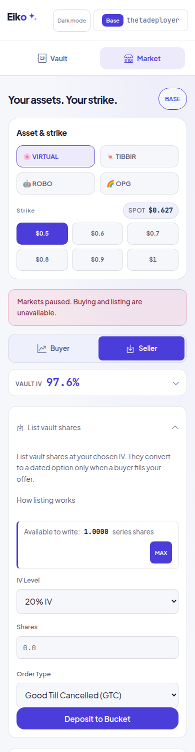
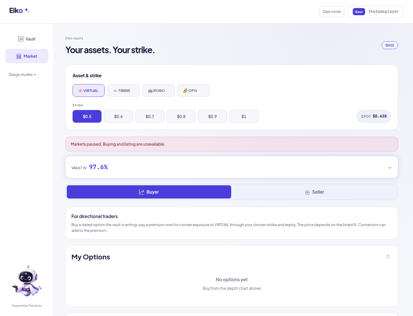
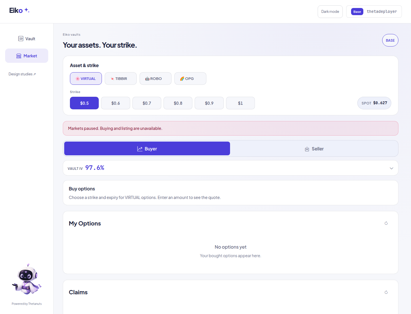
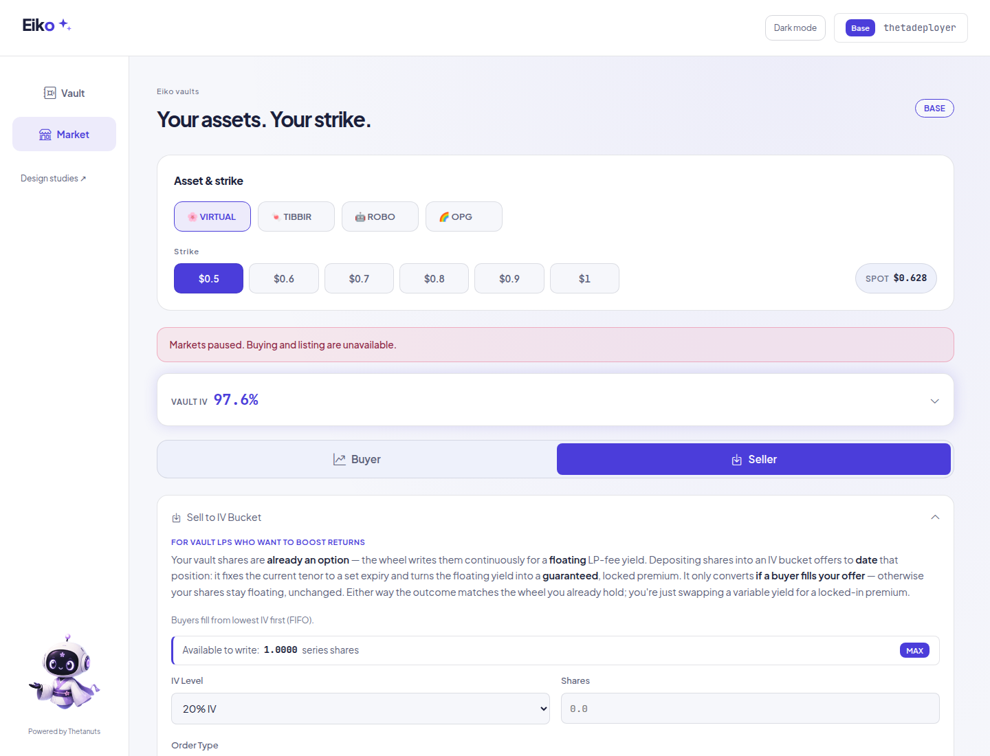
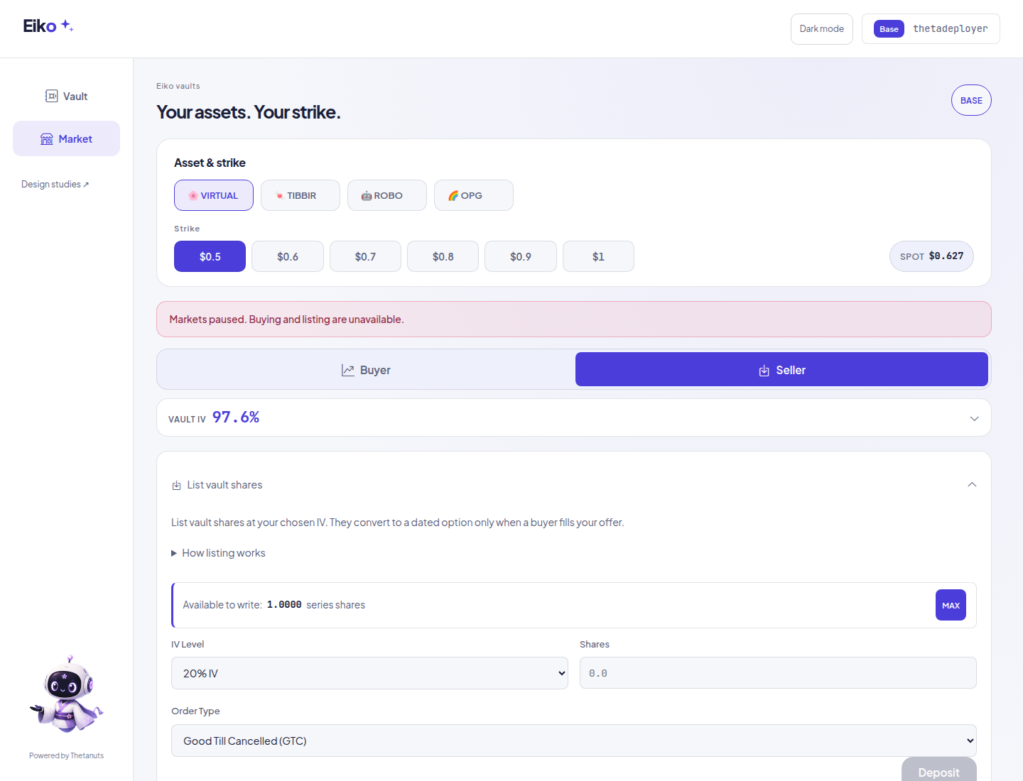
Paused listing now looks and acts disabled. The new submit-only gate follows existing market status; cancellation, claims and withdrawals stay outside it. No quote or return arithmetic changed.
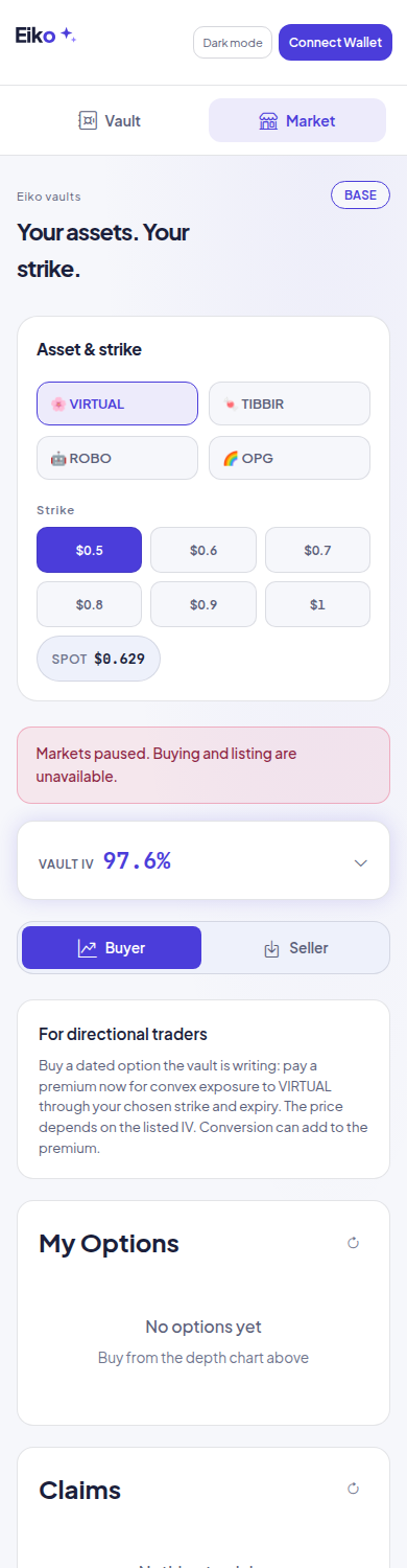
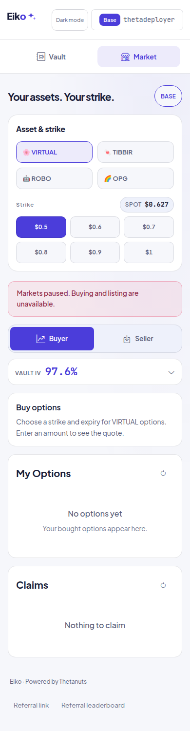
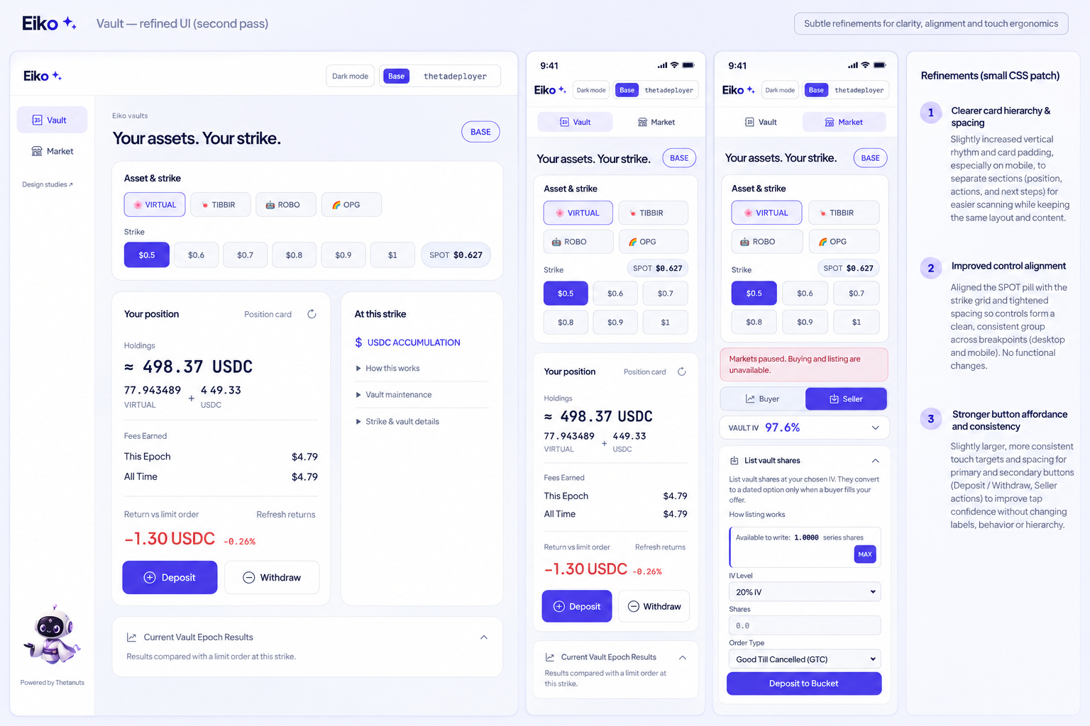
The designer compared actual before/after desktop and phone captures. Only useful refinements were applied; the final screenshots above are the implemented result. Pass 1 desktop · Pass 1 phone · Pass 1 seller.
| View | Initial capture | Implemented result |
|---|---|---|
| Vault · desktop | Before | Final |
| Buyer · desktop | Before | Final |
| Seller · desktop | Before | Final |
| Vault · phone | Before | Final |
| Buyer · phone | Before | Final |
| Seller · phone | Before | Final |
Fresh Astra review and targeted regression tests cover control bindings, frozen beta, responsive targets, modal/history visibility and pause-state recovery. Live checks are read-only; no transaction was signed.
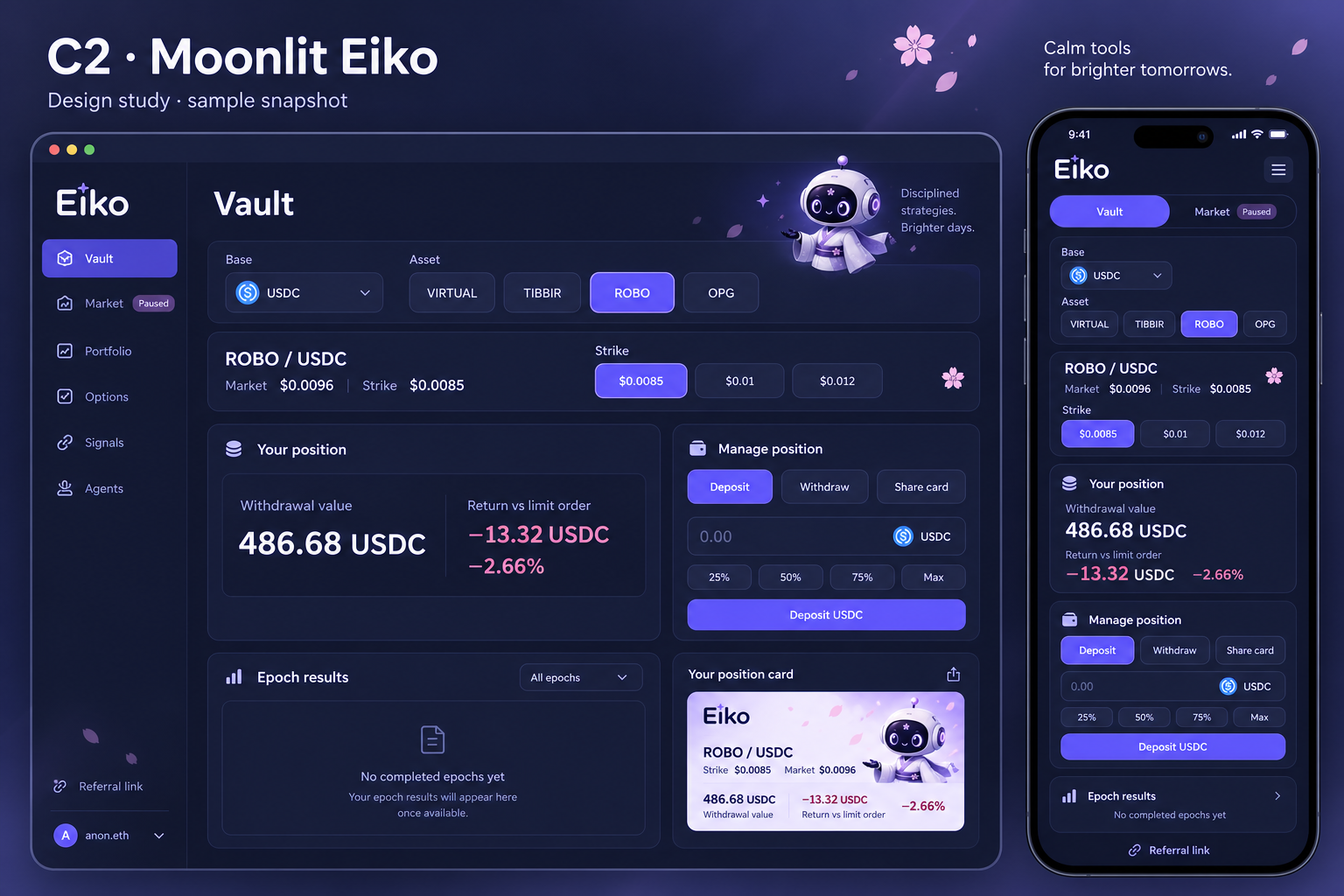
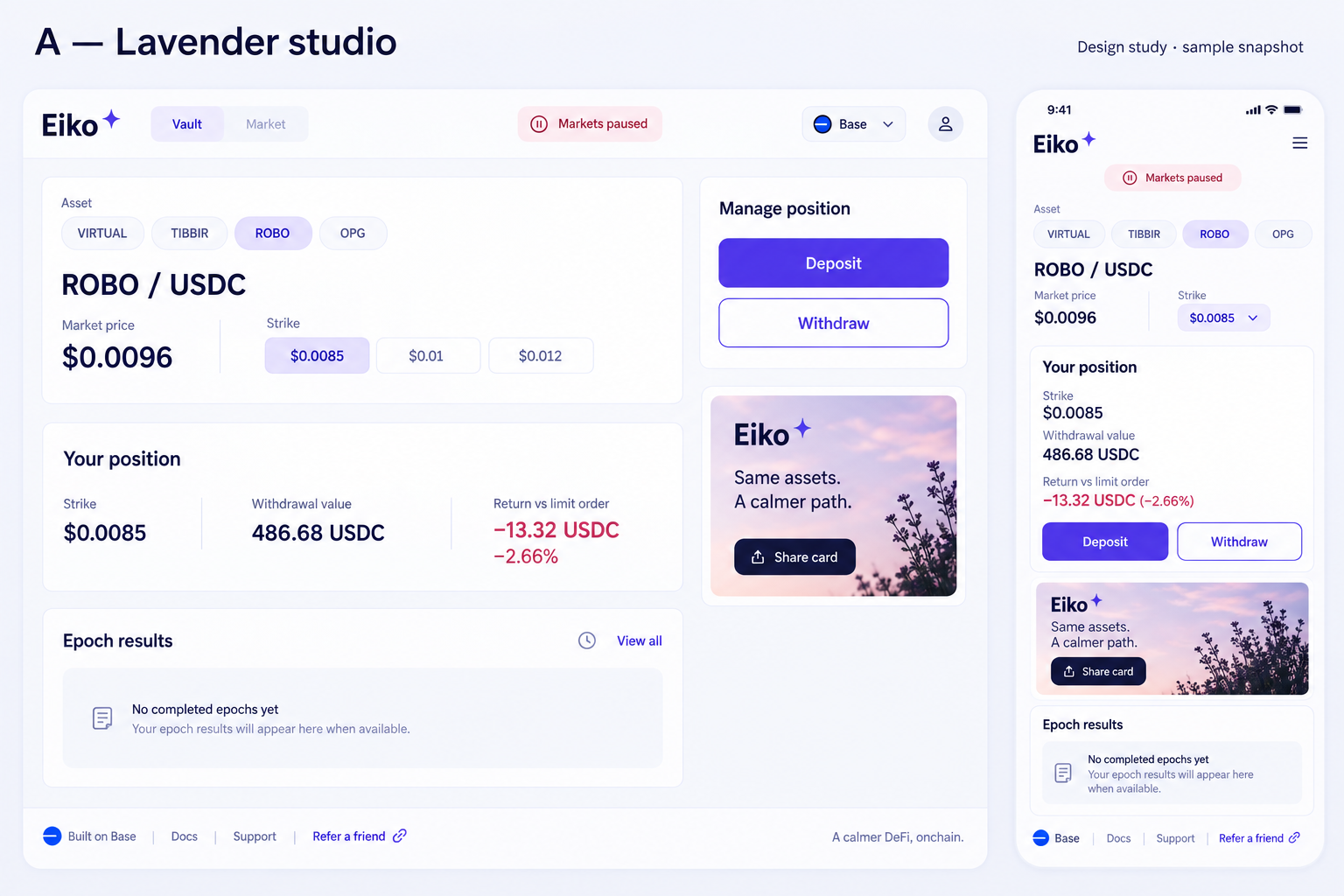
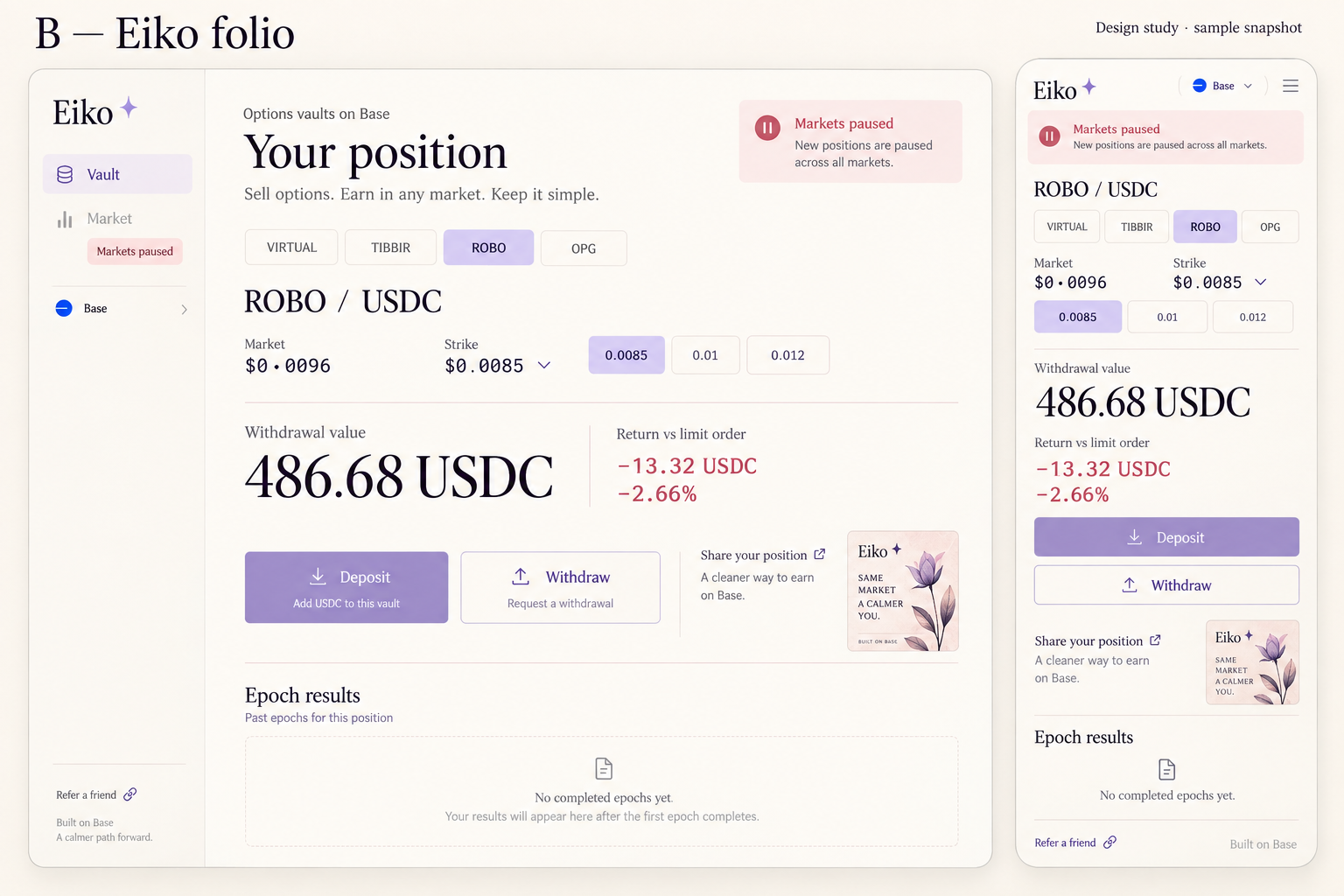
Pick a direction, or mix the layout, colours and card style.
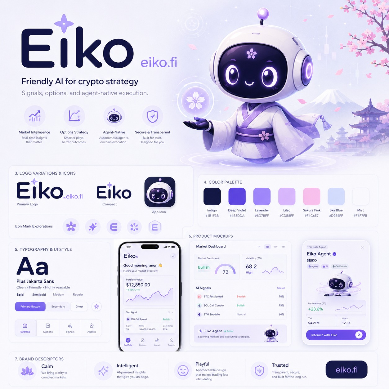
Round 2 uses Eiko’s existing guide and collateral as visual references: palette, type, blossoms and mascot character.
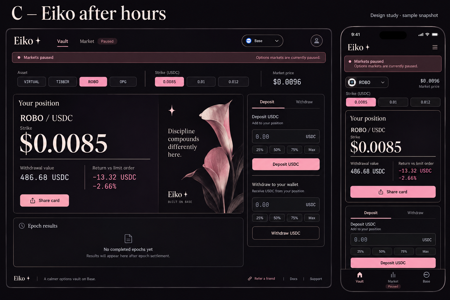
AI-generated visual studies. Sample figures, draft wording and navigation—not live app screens or new feature plans.
Existing design guide · Collateral reference · Prompts and review notes
The old segmented border fought the separate buttons. Imagegen suggested clearer spacing; the implementation also makes the strike targets equal-sized and lines them up with the assets.
Try alpha ↗ · Prompt and visual diff


Same Eiko mobile records, before and after. The implemented screenshot uses the captured values, not a later market snapshot.
Adopted: consistent insets, clear headers, a 2×2 fee summary and aligned columns. Kept the real gauge geometry and one disclosure arrow; no generated wording or numbers were copied into the app.
Try the updated alpha ↗ · Prompt and comparison notes


Closest to the guide: mist, violet, rounded controls and a light mascot touch.
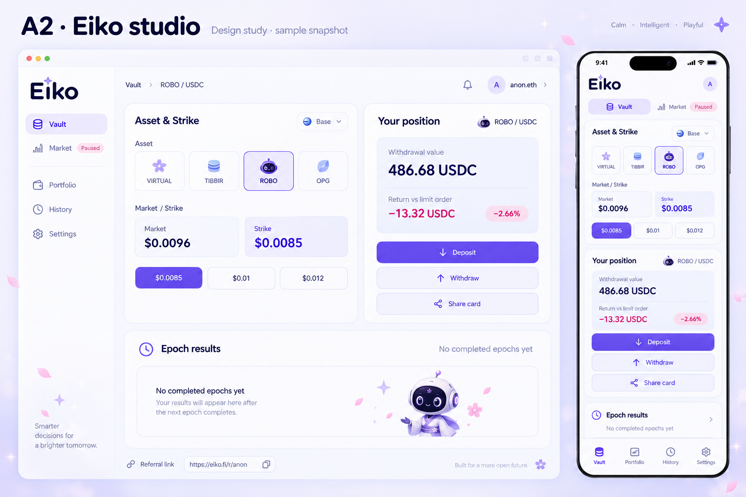
A lighter, spacious position layout with sakura details and a matching share card.
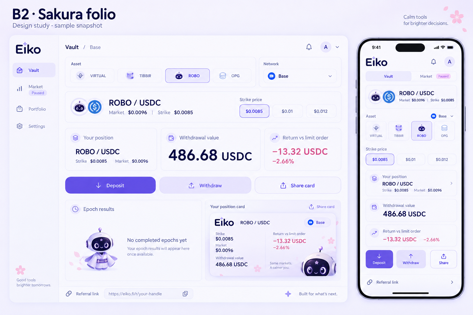
The same identity in deep indigo, with lavender controls and sakura accents.
Closest to beta: light lavender, clear controls and soft cards.
Cream, serif typography and a quieter editorial layout.
Ink and blush, extending Eiko’s share-card identity.